To really understand the true design narrative of Woven by Adam Smith, the latest culinary experience at Coworth Park, Editor Hamish Kilburn spoke to Martin Hulbert and Jay Grierson, both from Martin Hulbert Design…
Nothing about Coworth Park is what you would expect. Yes, it is a Dorchester Collection offspring – kind of like the step-sister of The Dorchester, but aside from the branding it doesn’t feel like it really belongs to any hotel group or cluster, and thankfully so.
Perhaps it is down to Zoe Jenkin’s unwavering leadership style, or perhaps its unrivalled destination in the heart of Ascot, that puts the hotel on the map. What I have come to learn about this charming luxury hotel set over 240 acres of picturesque Berkshire parkland is that its point of difference is in the detail, whether that be the contemporary wooden stairwell commanding attention the Mansion House, the charming home-from-home interior design scheme inside its premium suites, such as North Lodge, the exceptional flavours tasted throughout ones stay or the people – in house as well as commissioned – who make the hotel feel, well, like a family.
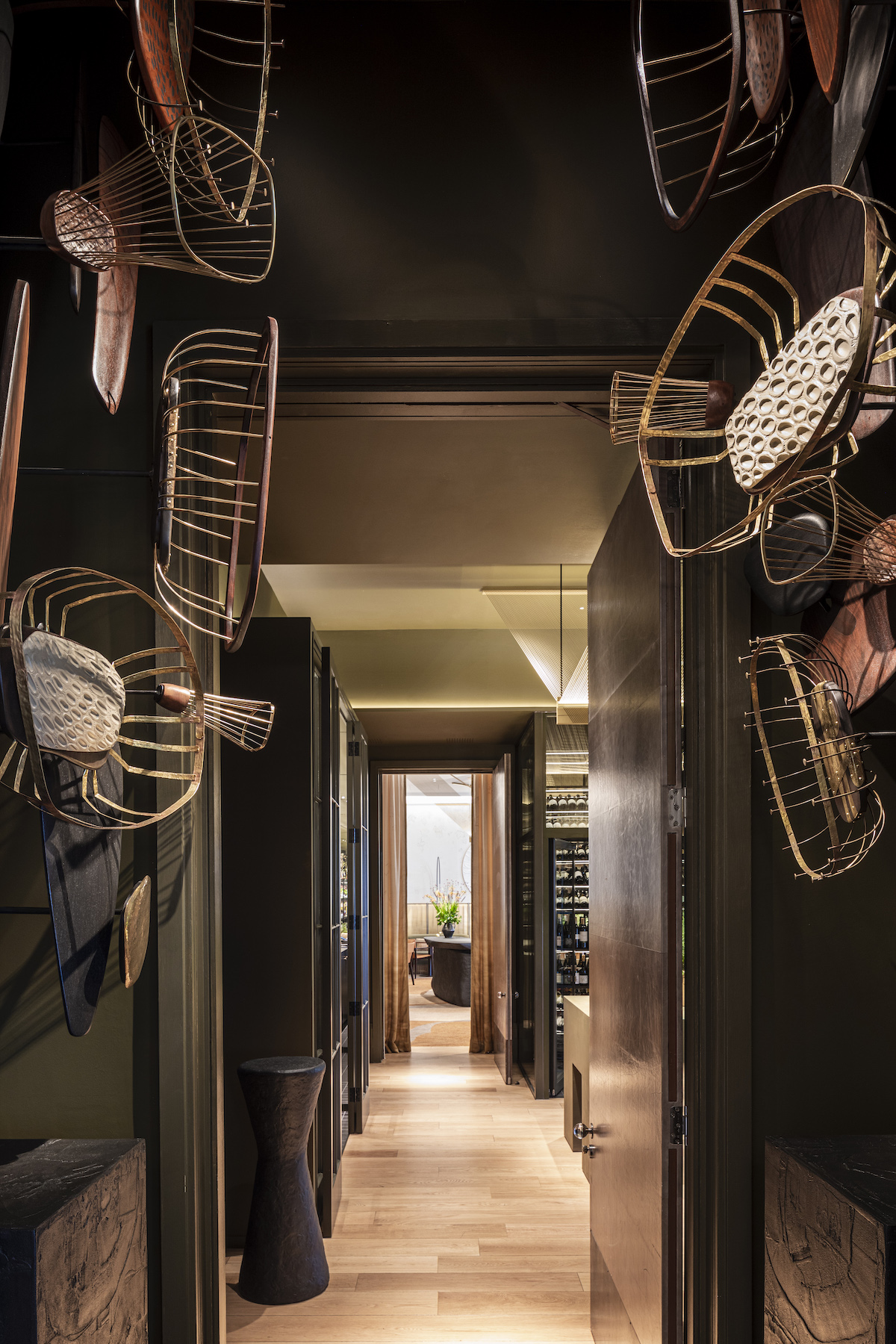
Image credit: Dorchester Collection
Martin Hulbert is one of those individuals who has become a synonymous figure next to the hotel. The original designer behind the hotel, he created its calming and timeless interiors. “Not only is it a beautiful building in a wonderful setting but the team have always been very open to our ideas and trusted us, so as designers it’s a dream project,” explained Hulbert. “We never approach our designs to fit in with trends and we feel it’s why Coworth Park has stood the test of time in terms of its interiors and the feel. It’s a special place and we are grateful to continuously return.”
Given that the hotel has always championed and supported those who understand how to usher its brand and image forward, it is no surprise that they asked Hulbert and his team at Martin Hulbert Design (MHD) back to design Coworth Park’s latest restaurant. Woven by Adam Smith showcases British produce, from fresh seafood to foraged mushrooms.
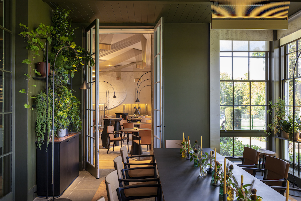
Image credit: Dorchester Collection
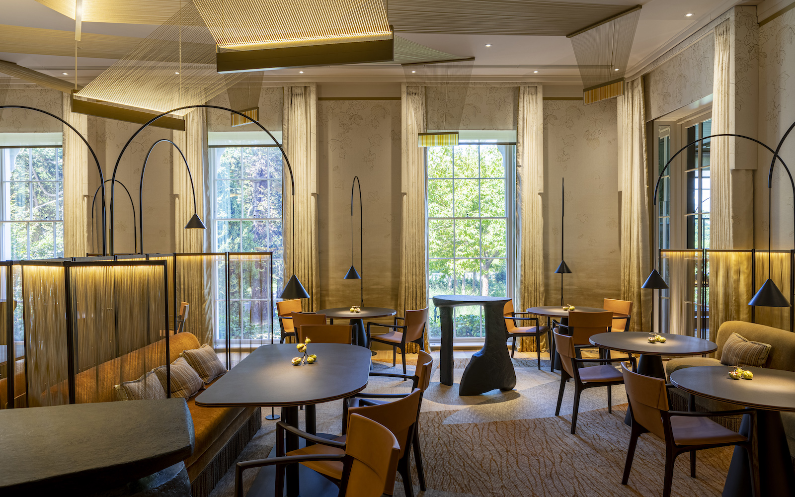
Beyond its menu, though, the design of the restaurant is soft with curtains and wallpaper that melt into the carpet, as well as practical with lamps that can be raised and lowered to suit daytime and evening moods. It’s also, in true MHD style, full of innovative, unexpected and playful details, such as high-table waiter stations made from papier mâchè, sculptures in the entrance made from recycled wood and quirky lighting that, excuse the pun, are metaphorically and physically woven into the restaurant.
As with all of Hulbert’s projects, there is much more than meets the eyes, which is why, while checked in to taste the menu, I was fortunate enough to sit down with Hulbert and his colleague Jay Gierson to understand the intricate details and challenges when creating Woven by Adam Smith.
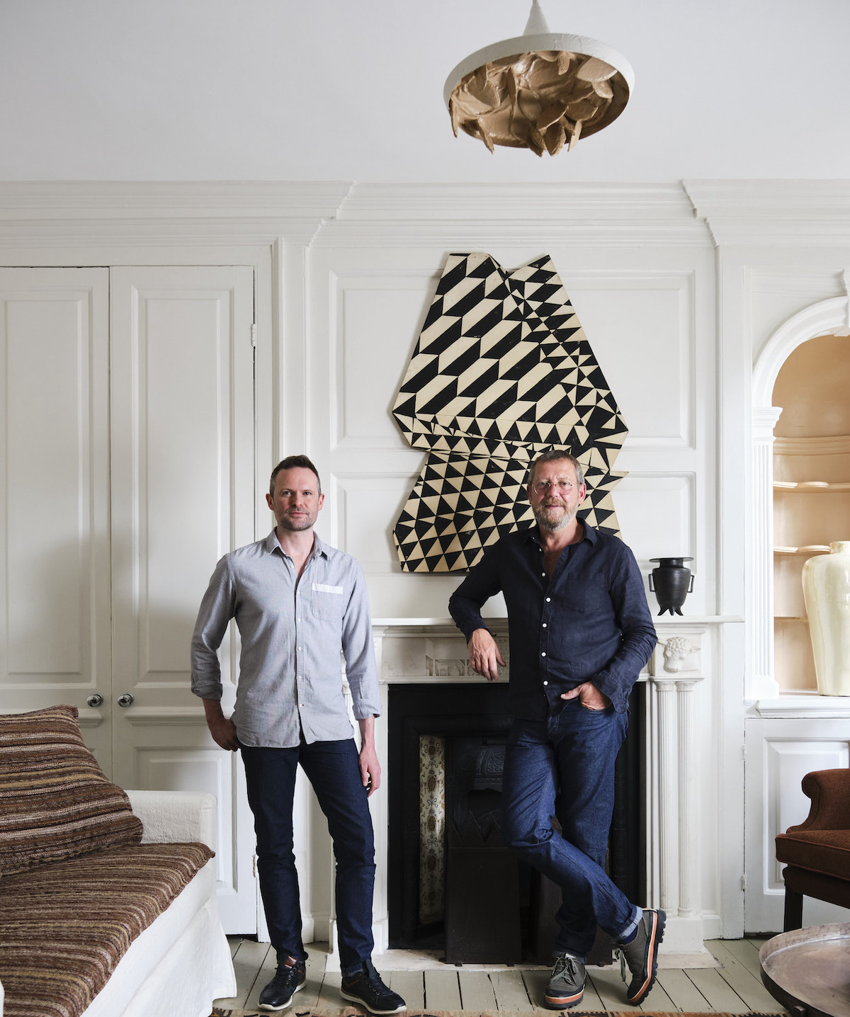
Image credit: Martin Hulbert Design
Hamish Kilburn: What was your initial interpretation of the ‘woven’ theme?
Martin Hulbert: This is the second time we have been given the brief for the restaurant, having overseen the original renovation of Coworth Park in 2010, so, although it was a new theme, it didn’t feel like we were starting totally from scratch. Conceptually designed around the autumn season, we’ve subtly interpreted this throughout the space from the warm, earthy colour scheme and use of natural materials to the lighting, all of which is bespoke to the project. We knew from the start that we wanted the design to be surprising yet sophisticated but certainly not in a stuffy way – an inviting space that elevates the dining experience and complements Adam’s incredible cooking. Collaborating closely with him from the start was also great; he helped shape our interpretation of the theme.
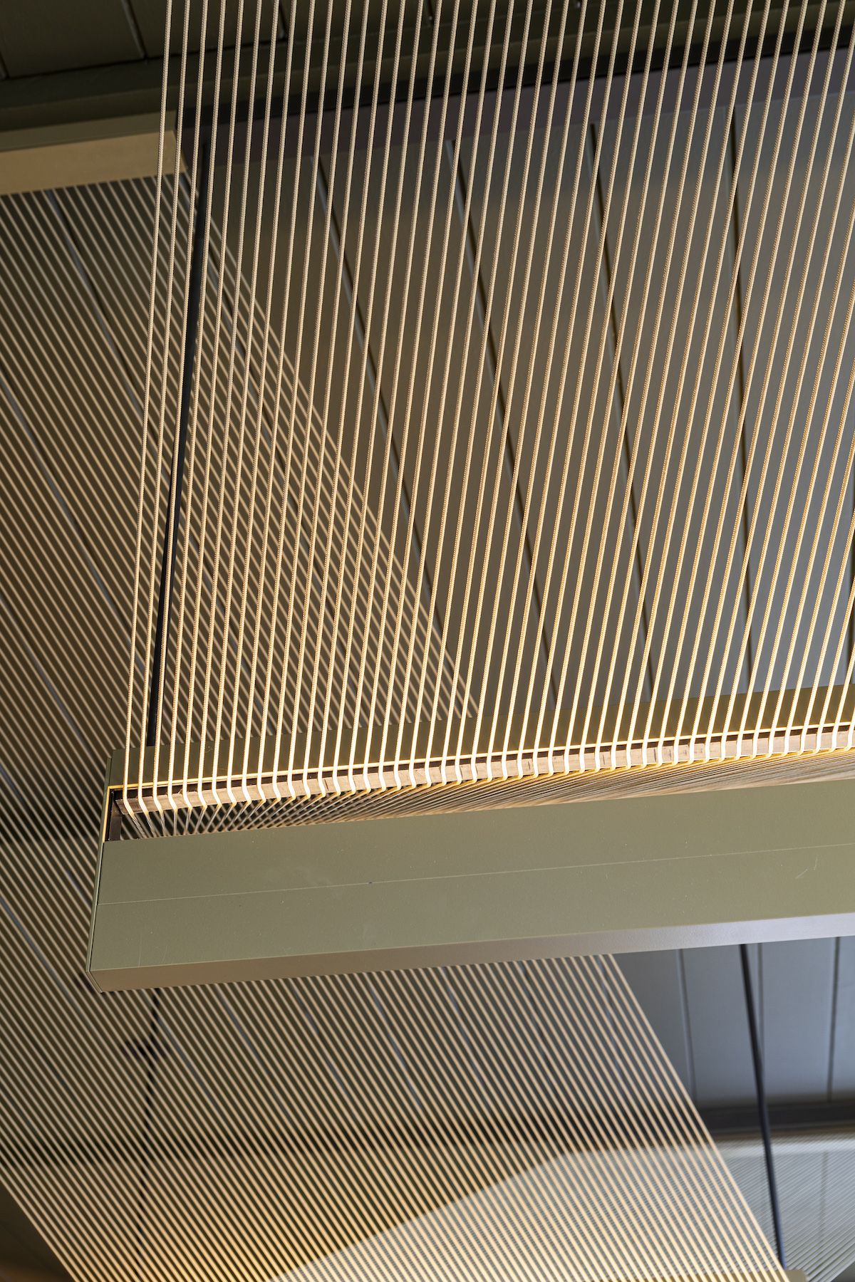
Image credit: Dorchester Collection
HK: The story around recycled materials used in the design is super inspiring. How difficult was this, in reality, to find solutions that would weather the demand from a luxury restaurant?
Jay Grierson: We always try to use recycled materials in our designs as not only is it sustainable but it also means you end up with something that is entirely original and bespoke, which fits well within the context of a luxury restaurant. For example, at the entrance to Woven, guests will see a set of sculptures by Marcus Crane and Dan Ainsworth which are made of recycled wood, metal and resin. These have drawn inspiration from the gardens at Coworth and immediately add a sense of theatre to the restaurant and make you feel as though you’ve arrived somewhere special.
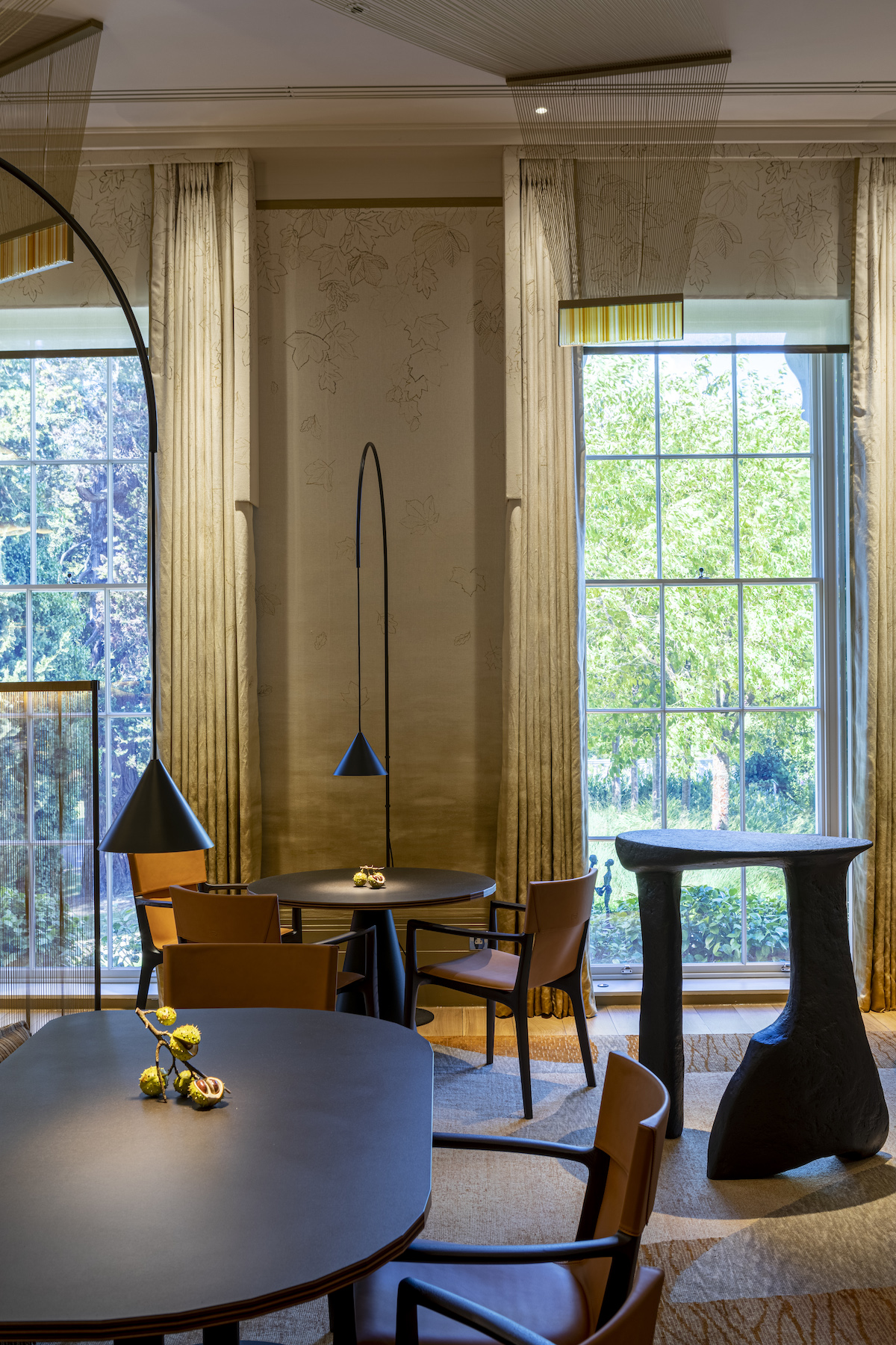
Image credit: Dorchester Collection
How does the design of the F&B space answer to the rest of the hotel?
MH: At Coworth Park the spaces are split into seasons relating to the aspect of the room and with Woven being themed around autumn it fits perfectly with the notion of it being a countryside hotel for all the seasons. It helps that we’ve designed the rest of the hotel, rather than this being an isolated project as there’s a subtle continuity that can be seen throughout the interiors.
HK: What were the main challenges during this project?
JG: Every small detail is original at Woven, which made it a very complex scheme to pull together as there were so many moving parts and different makers involved. It’s been worth the effort though and we are delighted that we’ve been able to champion creativity and craftsmanship.
MH: In many ways Woven is a showcase for the fantastic artisans and craftsmen who have helped us create something totally original.
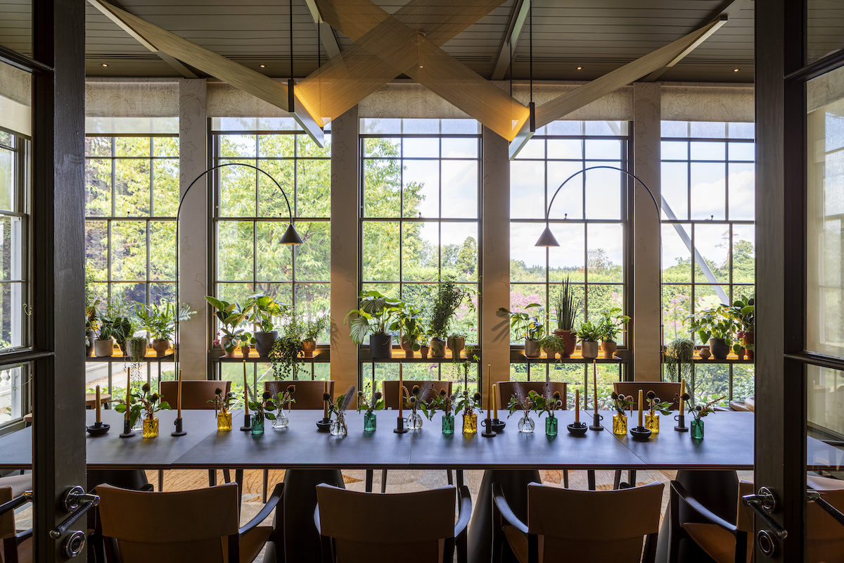
Image credit: Dorchester Collection
HK: Tell me more about the wallcoverings, changing tones to almost meet the carpet…
MH: The walls are a bespoke MHD design and feature a subtle hand-drawn oak leaf motif printed onto linen. This complements the inventive contemporary lighting installation, which is designed by British architect Umut Yamac in collaboration with MHD and mimics a forest canopy with rays of light pouring through the trees and over the restaurant interior.
JG: The bespoke wool carpet then mimics this with a very subtle shadow effect. As you say, it’s very tonal which brings a warmth to the space. The tones and fabrics used in the wallcovering and carpets also transition very well from day into night, which was important as the space is open from breakfast through to dinner.
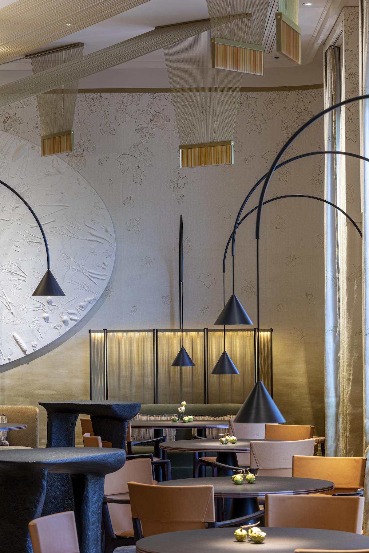
Image credit: Dorchester Collection
HK: I love the papier mâché high tables throughout the restaurant. It seems so simple, yet incredibly effective. How did the client react to this idea when you first presented it?
MH: We love them too! When working with The Dorchester Collection, they have never stamped on our ideas and instead embraced our creativity, which has inspired us to be more adventurous. They’re made from papier maché and resin, and inspired by the works of British artist Henry Moore.
JG: We explained to the client that these represent the buttress roots of trees and they were really on board with the idea, particularly from a practical point of view as with such an exciting yet complex menu the staff needed waiter stations. We wanted everything part of the design to fit with the narrative and to add intrigue, and we feel these subtly do that without being overbearing.
Main image credit: Dorchester Collection


