Editor Hamish Kilburn scoops the design exclusive review of Pnoé Breathing Life – a new, luxury wellness hotel in Crete that has emerged…
Strengths on the hospitality landscape in Greece lie on contrasts, not similarities. Crete, the largest among the Greek Islands, is land-locked with ancient ruins, mountainous terrain, diverse gastronomy and what is fast becoming a flourishing luxury and wellness hospitality scene.
To thrive beyond early years here, each hotel must open to offer something new. For Pnoé Breathing Life, the latest wellness hotel to emerge in Crete, that meant creating a point of difference in its design. For the owner, Marita Karatzi, ‘difference’ translates to ‘risks’. It’s no coincidence, for example, that she decided to open a luxury hotel in an area that isn’t the obvious place for a five-star hospitality experience – on eastern fringe of the capital Heraklion. It’s clear from meeting her, though, that Karatzi has her sights set on leading new trends, not following them, while answering to the energy of the island.
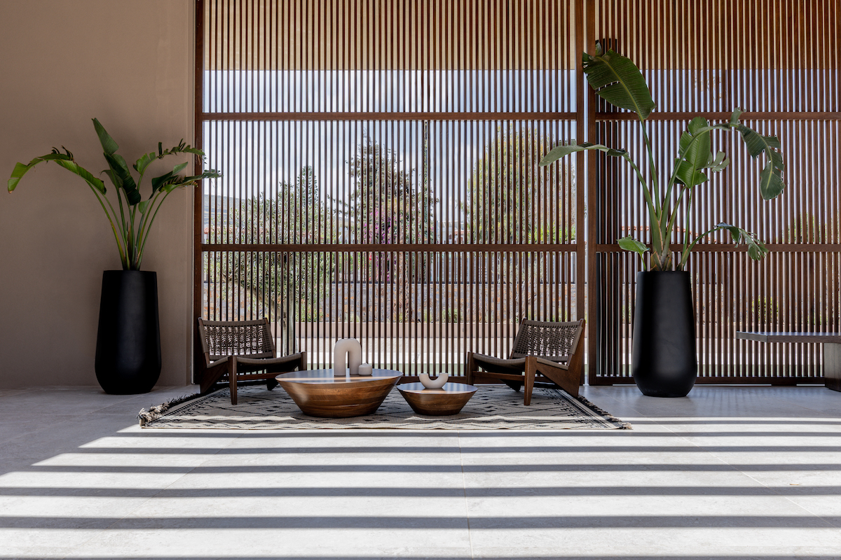
Image credit: Pnoé Breathing Life
Opening with the ambition to push boundaries in design and hospitality style to own itself as the destination wellness hotel in Crete, Pnoé Breathing Life was designed by Cube Concept – and it took just 10 months to complete. In that time, Aria Lironi, Design Director, and her team transformed the ruins of a former hotel – building the design around the skeleton of the existing architecture – that was left derelict for years. Her brief was to create an ‘oasis of calm’. But the deadlines were anything but tranquil. “To be honest, I work better under pressure,” she told me. “We finished the design fast, and we ordered the materials before we started construction.” In moments like these, on tight projects like Pnoé, I imagine it is convenient and seamless having designers, architects and contractors all under one studio roof.
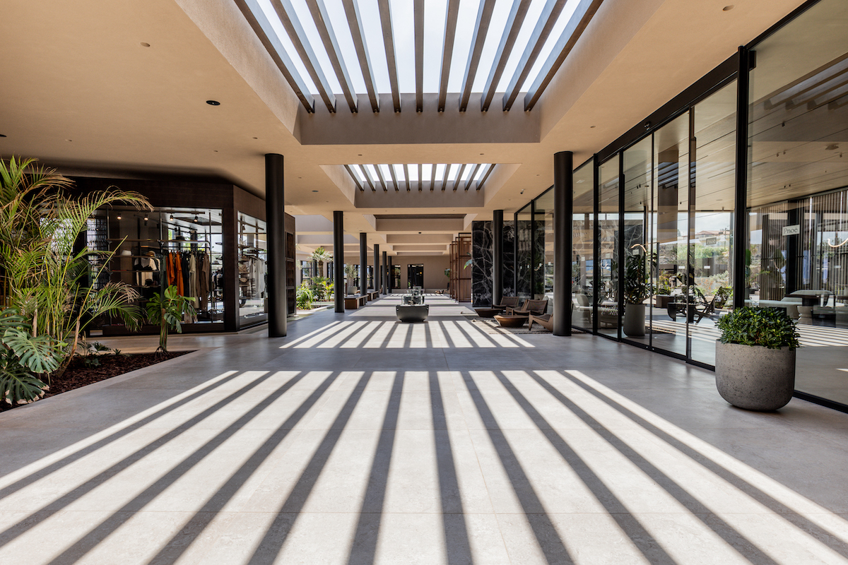
Image credit: Pnoé Breathing Life
To fully understand the design narrative of Pnoé Breathing Life, you first have to learn about the materials. Lironi opted to use local stone as a subtle way to inject a robust sense of place, while she specified quality tiles imported from Italy and Spain. Beyond sourcing locally, though, the designer and architect also wanted to retain materials that existed in the previous site. Outside each room, for example, and in various other areas around the hotel – such as under the bar – geometric-style walls form a motif of soft boundaries and add a layer of colour, as well as texture, to the overall design narrative. “This is a reference to the old building, a sensitive nod if you like” the designer said. “I really wanted to find a way to refer to the old hotel. This particular style [of surface design] was seen in the rooms previously. We have, taken it – I guess dissected it from the rooms – and injected it in others areas of the hotel to add character.”
The result of the savvy design scheme is a 60-suite hotel that exists both in total privacy and as part of a wider community – it feels, at times, sacred but with contemporary twists at unexpected moments. Perhaps the best example of this is in the arrival experience. Guests’ firsts impressions of the architecture and design are cast as they walk through floor-to-ceiling wooden shutters. They capture a view that spans through the hotel, directed towards low-level architecture that embraces the main swimming pool. “We designed this area to feel like a big hug,” explained Lironi. “The swimming pool is the core of the property, and the rest of the hotel faces inward.”
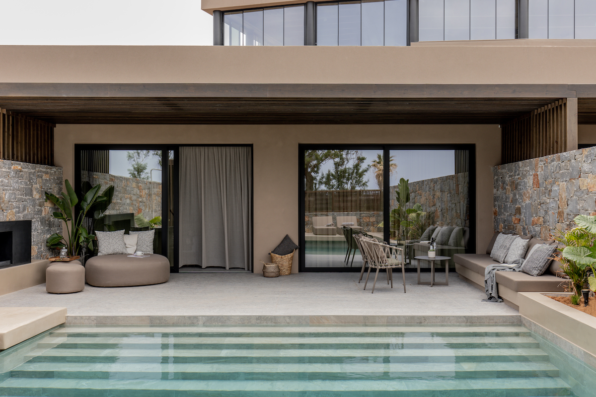
Image credit: Pnoé Breathing Life
The lobby/lounge area, in comparison, is secondary. Positioned on the side, almost out of sight, it offers a private, relaxed and intimate check-in experience. It is grounded with natural materials and layered with earthy tones. Contemporary accents, such as in the furniture, the strong LED lighting scheme and Bauhaus-inspired art, reflect the brand’s sharp, vogue-like character.
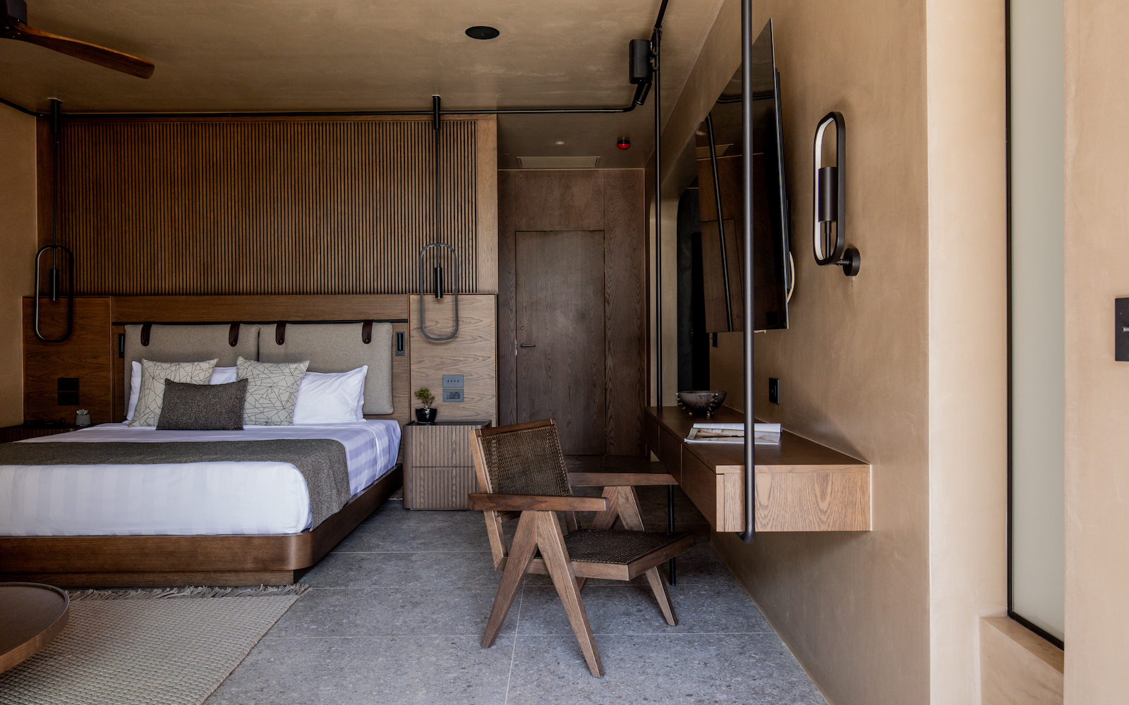
If we are talking and celebrating differences, then we cannot ignore the hotel’s 60 suites, all of which come complete with private pools – it’s a nice touch, but the real statement comes in the interior design inside the rooms, which is, perhaps, the largest and most welcome surprise in the overall the hospitality experience at Pnoé Breathing Life. And it, the design, works. I mean, it really works!
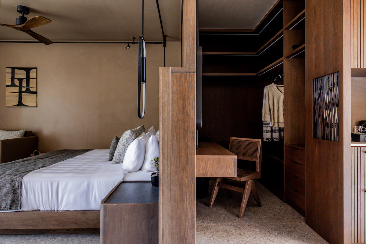
Image credit: Pnoé Breathing Life
Answering to the existing, white-washed hospitality scene in and beyond what is stereotypically ‘luxury’ in Greek guestroom design, in its own unapologetic style, the hotel’s suites are muted, unpretentious – dare I say even masculine. They are layered with dark, natural materials to create and compliment a moody, yet wholesomely calming, setting.
Adding warmth to the space, the lighting scheme is made up of a series of spotlights on black rails and contemporary pendants that cascade from the ceiling. “We were challenged with the lighting,” confessed Lironi. “If we integrated the lighting into the ceiling, like we initially wanted to do, then it would reduce the height of the suites, which we wanted to avoid. So, instead, we introduced the matt-black railings, which also have a practical use.” The rigs are adaptive in their design. As well as lighting, they frame the room and can also in places, if required, be used as an extra, exposed wardrobe railing.
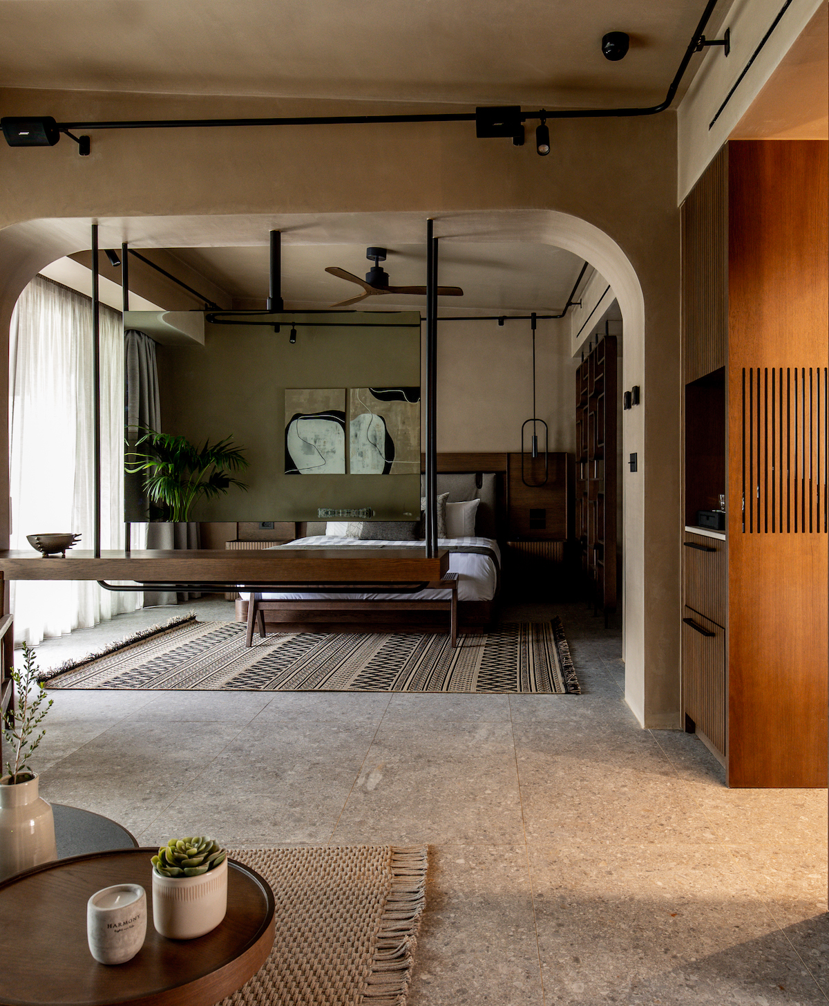
Image credit: Pnoé Breathing Life
There is a strong sense of harmony in the materials inside the suite. The rooms are accented with seating that have feature stylish pops of rattan. Meanwhile, the wardrobes and case goods share the same design language – the slatted panels, which blend into the walls, are finished in the same dark, moody tones.
In order to utilise space, intuitive partitions have been made from wood that reveal an extra mirror – the overall open-plan design of the suites make them flow with ease.
This is the case all around the hotel, in fact. Where there are steps, there are subtle ramps, which in most cases – the curvaceous walkway from pool to restaurant, for example – feels more organic to use over stairs, and also creates a depth to the design and architecture. “The hotel’s rooms may be on one level, but the ground when we got to site was not flat,” Lironi explained. “Therefore, in order to ensure the hotel was accessible for guests, as well as our housekeeping trollies, we put great emphasis on the landscape architecture to ensure each space filtered seamlessly into the other.” This is complimented with stunning plants and trees, framing walkways, that quietly add to the hotel’s contemporary-meets-nature look and feel.
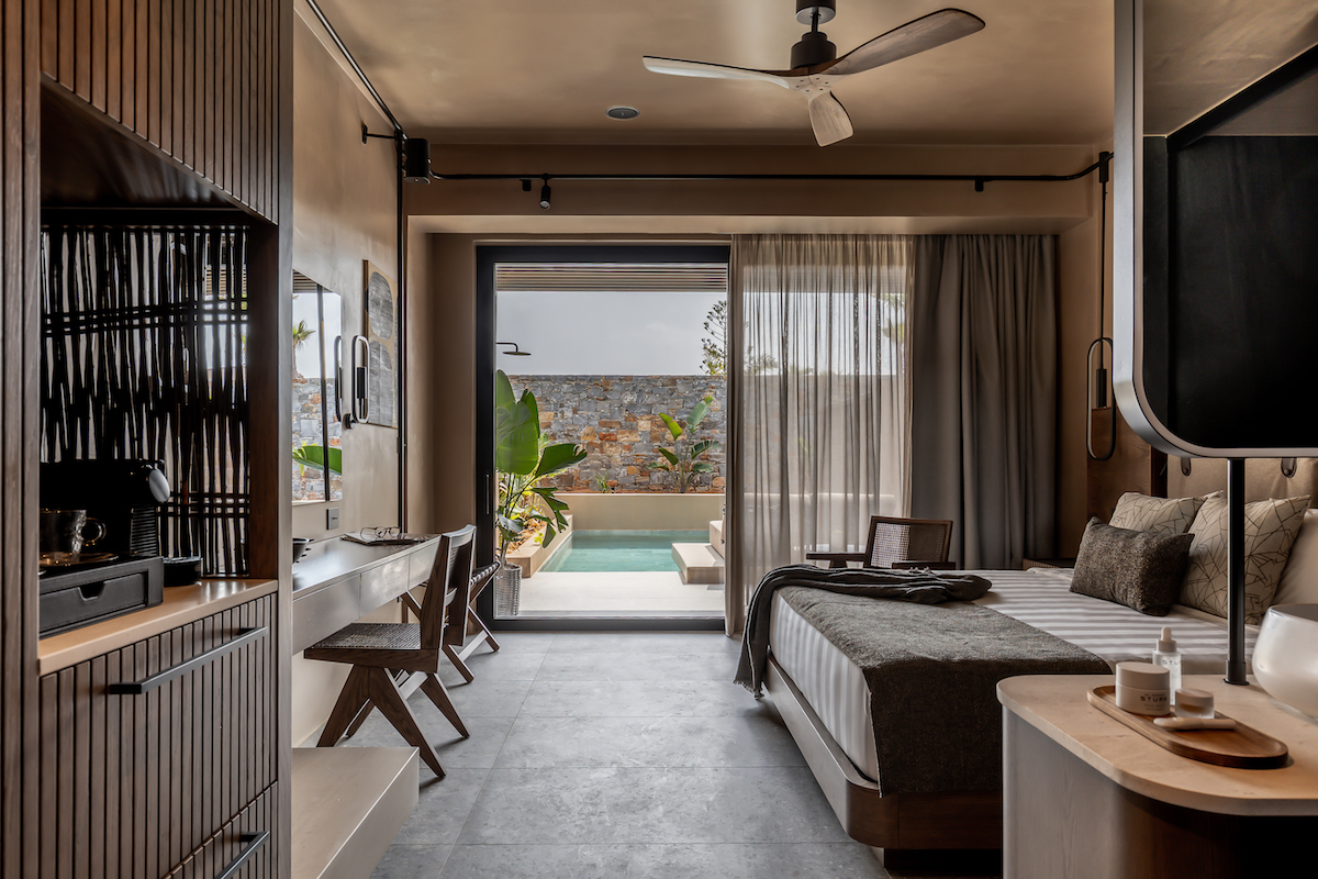
Image credit: Pnoé Breathing Life
The pool, meanwhile, is complete with fabric cabanas, wide wooden sun beds and a natural aesthetic that compliments the panoramic views of both sea and mountain. With the central focus on wellbeing, though, the spa is where the heart of the hotel can be found (and felt) – wellness is, after all, the hotel’s main mantra.
Guests enter the spa through glass doors and are immediately channelled towards the treatment rooms and wet area via a corridor of steppingstones that rests on water. The muted design scheme inside is idyllic – cave-like with natural stone against frosted glass – yet the tones and textures used are in keeping and very much connected to the overall design scheme.
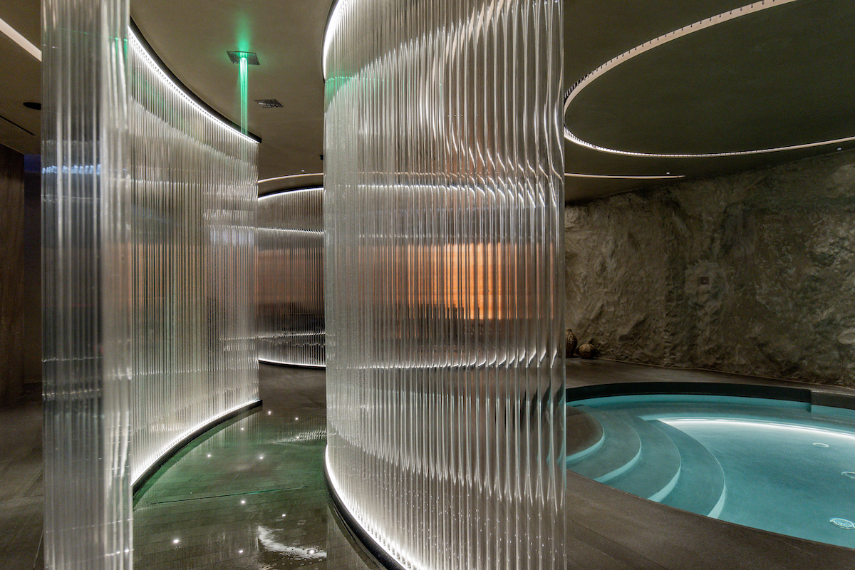
Image credit: Pnoé Breathing Life
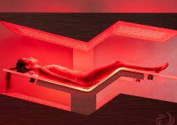
What really sets this wellness hotel in Crete aside from others, though, is its innovative and high-tech offerings, such as Hyperbaric Oxygen Therapy, Zerobody and Breathwork therapy, alongside a state-of-the-art fitness facility and professional personal trainers. The spa is balanced with a state-of-the-art fitness centre and relaxation area that is complete with waterfalls, Himalayan salt stones, a wood fired sauna and an ice fall.
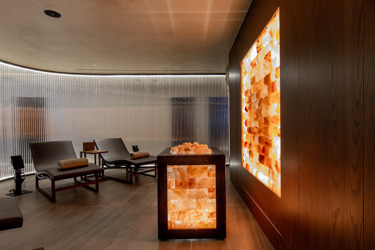
Image credit: Pnoé Breathing Life
Cretan cuisine has its own distinctive character amid the Mediterranean palate served at Pnoé Breathing Life, drawing on seafood, lamb, herbs and farm-grown vegetables. Pnoé’s focus is, I’m told, on nourishing guests with high quality produce. Its two restaurants use local suppliers, with the major of its ingredients inside the hotel’s premium F&B offering, Uranus, sourced from the must-visit Peskesi Organic Farm. This provides an authentic and quality taste of the island that changes throughout the season.
As like elsewhere in the hotel, lighting is a protagonist in the restaurants – and a lot of it is bespoke. “This piece,” Lorini said pointing up at the ceiling lighting in the Anasa restaurant, “was inspired by ‘flowing air’. We wanted this space of the hotel to feel open, and without boundaries.” In addition to the lighting, the furniture has also been made bespoke. In the restaurant’s bathrooms, meanwhile, Lorini took the restroom beyond its practical use, and created an almost playful experience, with bulb-like taps from Gessi and stone-like washbasins.
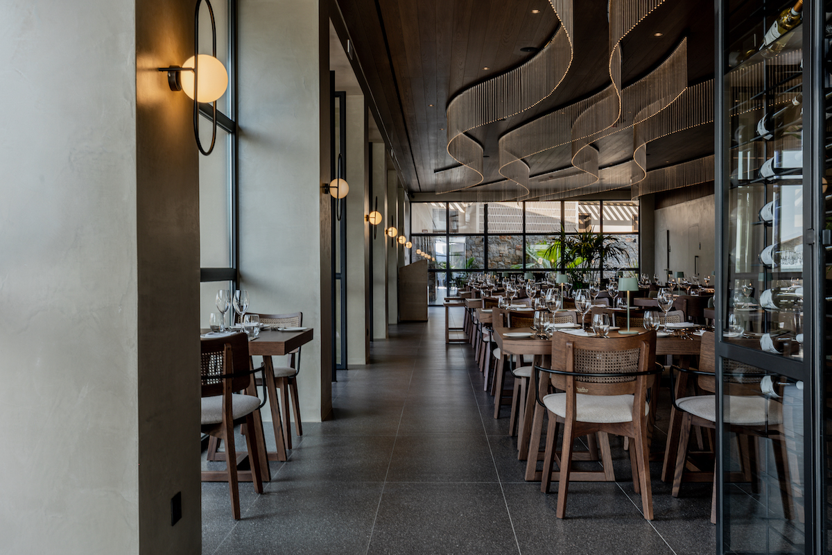
Image credit: Pnoé Breathing Life
Pnoé Breathing Life is labelling itself as a next-gen wellness hotel. But as the sound a saxophone aptly amplifies around the main pool during the hotel’s official opening party, I can’t help feeling like there is so much more soul in this new boutique luxury hotel that is waiting to burst out.
Not one to hang around, or rest for that matter, Karatzi’s next chapter for Pnoé has already started. Rumours are that she has purchased the land that sits in front of the hotel, directly in front of the beach with the aim to expand with more rooms. “I have already completed the designs,” Lironi said enthusiastically. “Whether they get approved or not is an entirely different matter.” And with that, I guess we will have to wait, with bated breath – pun intended – on how Crete’s latest and most anticipated wellness hotel will indeed settle in to its natural surroundings.
Main image credit: Pnoé Breathing Life


