When Hotel Designs learnt that industry powerhouse Yabu Pushelberg had completed its two-year reimagination of the historic Park Lane New York, we needed to react fast. So, we sent Tonje Odegard over the pond to check in to the landmark hotel to explore its new design era…
Where do I start with this remarkable transformation of the renowned Park Lane New York? Global design studio and industry heavyweight Yabu Pushelberg has, in collaboration with LUCID (the hotel management Highgate’s in-house design team, who has kitted out the hotel’s new rooftop bar), reawakened the spirit of an iconic hotel and enhanced the guest experience even further.
Refurbishing a historic hotel without losing the integrity and identity that so strongly resides in its walls is a tall order. For guests entering the hotel for the first time and for seasoned visitors returning to their home-away-from-home there is a strong sense of expectation. It’s for this reason the designers decided to embrace Park Lane’s eccentric legacy and let it shape the new design language; give the guest what they would want and anticipate from an institution like Park Lane but package it up in an entirely new and unforeseen delivery.
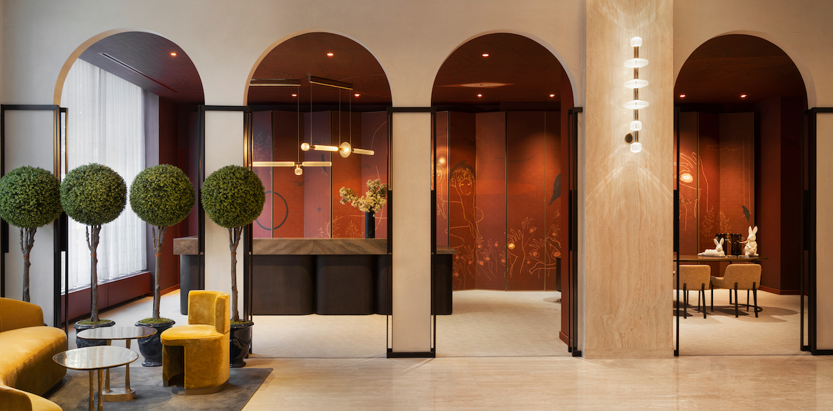
Image credit: Alice Gao
Situated at the intersection of Fifth Avenue and Central Park South, there are a lot of other iconic competition in the neighbourhood, from The Plaza Hotel, Carnegie Hall, and The Museum of Modern Art. In other words, the team at Yabu Pushelberg knew that there were more than one reason to make the designs stand out.
Nonetheless, the design studio’s starting point for the design narrative started as it always does, with an immersion in the hotel’s locale, culture, and heritage. We’re talking old New York, decadence, glamour, glitz, and elegant vibrancy. Inspired by the hotel’s natural exuberance, the studio sought to inspire Park Lane New York’s renaissance. Rather than dismissing the hotel’s past, Yabu Pushelberg chose to celebrate its storied history by asserting its original spirit as an anchor upon which to build layers of wit, charm, exploration, and discovery.
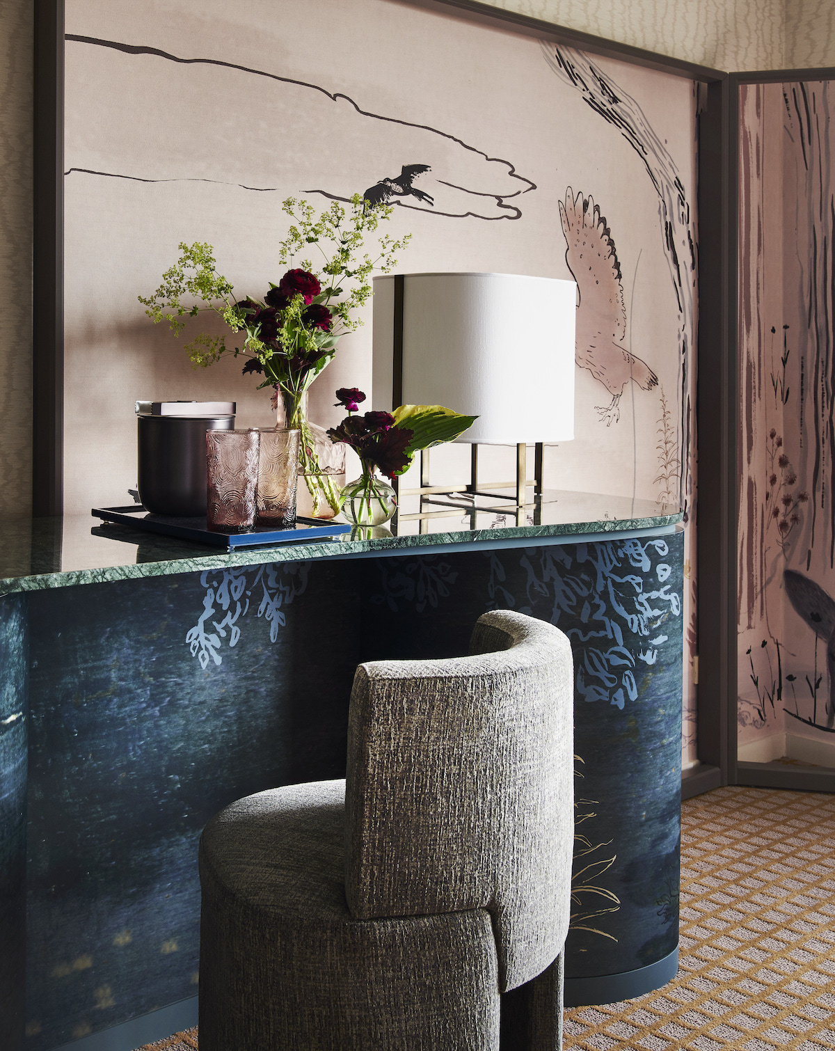
Image credit: Adrian Gaut
In fact, the designers used the hotel’s previous owner, the iconic American businesswoman Leona Helmsley and her dog Trouble, as an inspiration for the design story. Known for her flamboyant and mischievous personality, the designers aimed for a colour palette that would evoke those exact emotions. This includes sophisticated creams starkly contrasted by deep and dark features. In particular, they focused on her dog, who was left with the entirety of his owner’s remaining fortune upon her death. The designers have imagined a young, dapper, and handsome dog residing at the hotel, living a life of lavishness, hosting opulent extravaganzas, proper tea parties, and chic soirées to be shared and enjoyed alongside his discerning and worldly companions.
Elsewhere, inspiration was drawn from the hotel’s leafy surroundings near Central Park and upper Manhattan’s overall sophistication. New York’s ubiquitous newsstands and landmarks such as Grand Central Station and beloved Bemelmans Bar served as further sources of design creativity.
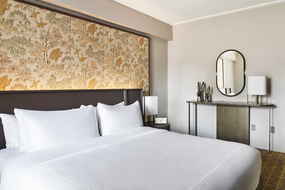
Image credit: Adrian Gaut
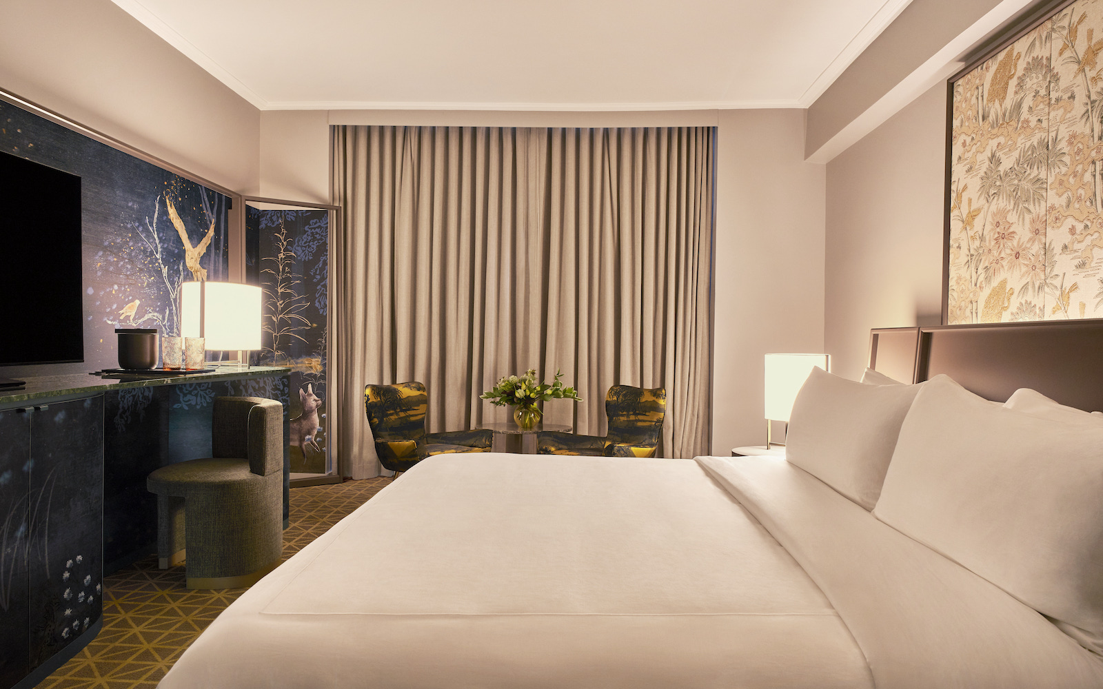
This is most apparent in the bedrooms, which are effortlessly luxurious. Either with city views or vistas overlooking Central Park, visitors are guaranteed epic New York views, which does the majority of the work. Painted dressing room screens and headboards mirror the naturalistic park scenes in an artistic and stylish way while deep pastels, bright colours and dark blues add that touch of glamour. The distinct Art Deco of New York’s yesteryear is the overarching theme with posh velvets, patterned wallpapers, and curved edges.
A similar theme of Art Deco opulence follows through to the guest bathrooms, with golden taps, spacious showers, free-standing circular baths, and monochrome floor tiles against marble wall slabs.
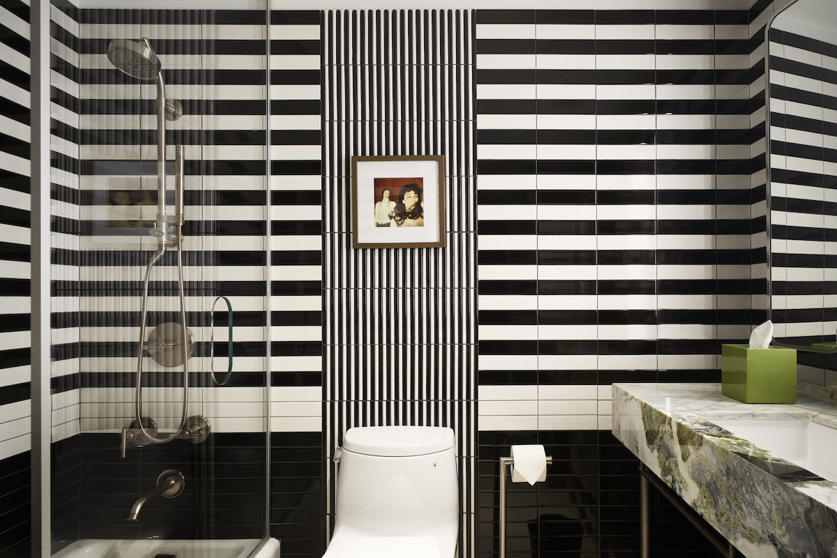
Image credit: Adrian Gaut
Taking a closer look at the public areas, elegant details are what create the magic. Yabu Pushelberg repurposed Park Lane New York’s original chandeliers, sconces, and fixtures to sustainably infuse a modern graciousness throughout the property. This is particularly apparent in the nooks and crannies of the lobby. Curvy Art Deco furniture, illustrated wallpaper, animal figurines, and landscape-printed custom armchairs are just a few of the ones worth mentioning. The lobby’s curvy staircase fits nicely in with the glossy wall panels depicting natural wood and we especially love the separated check-in area, entered via Art Deco arches.
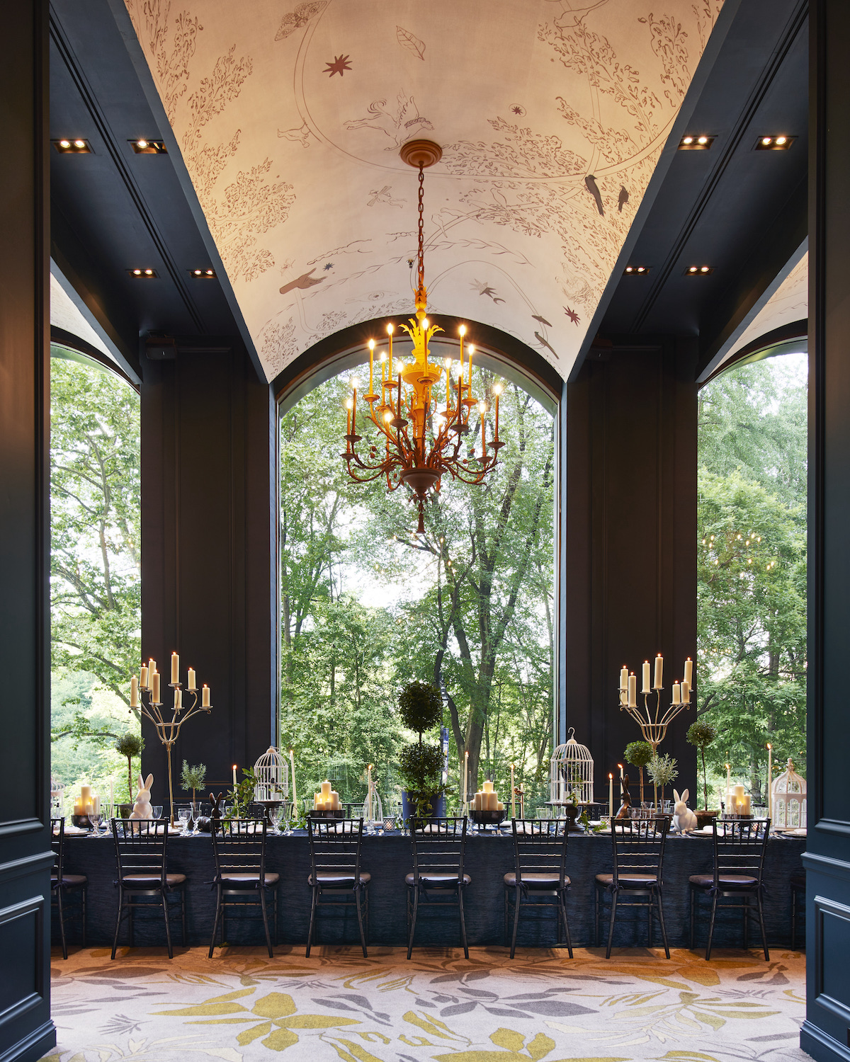
Image credit: Adrian Gaut
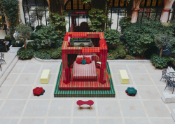
Moving onto the hotel’s F&B outlets, let’s start with the Rose Lane bar directly opposite the lobby, on the ground floor with its own separate entrance. The most striking features here are the giant crystal chandeliers and illustrated wall panels contrasted against deep, dark walls and ceilings. Adjacent to it is the conservatory-styled garden, which provides more seating. The brightness and airy feel to this space is an intriguing juxtaposition to the main bar space and provides respite to the dark and sensual indoor area. Full of greenery, it feels fresh and invigorating.
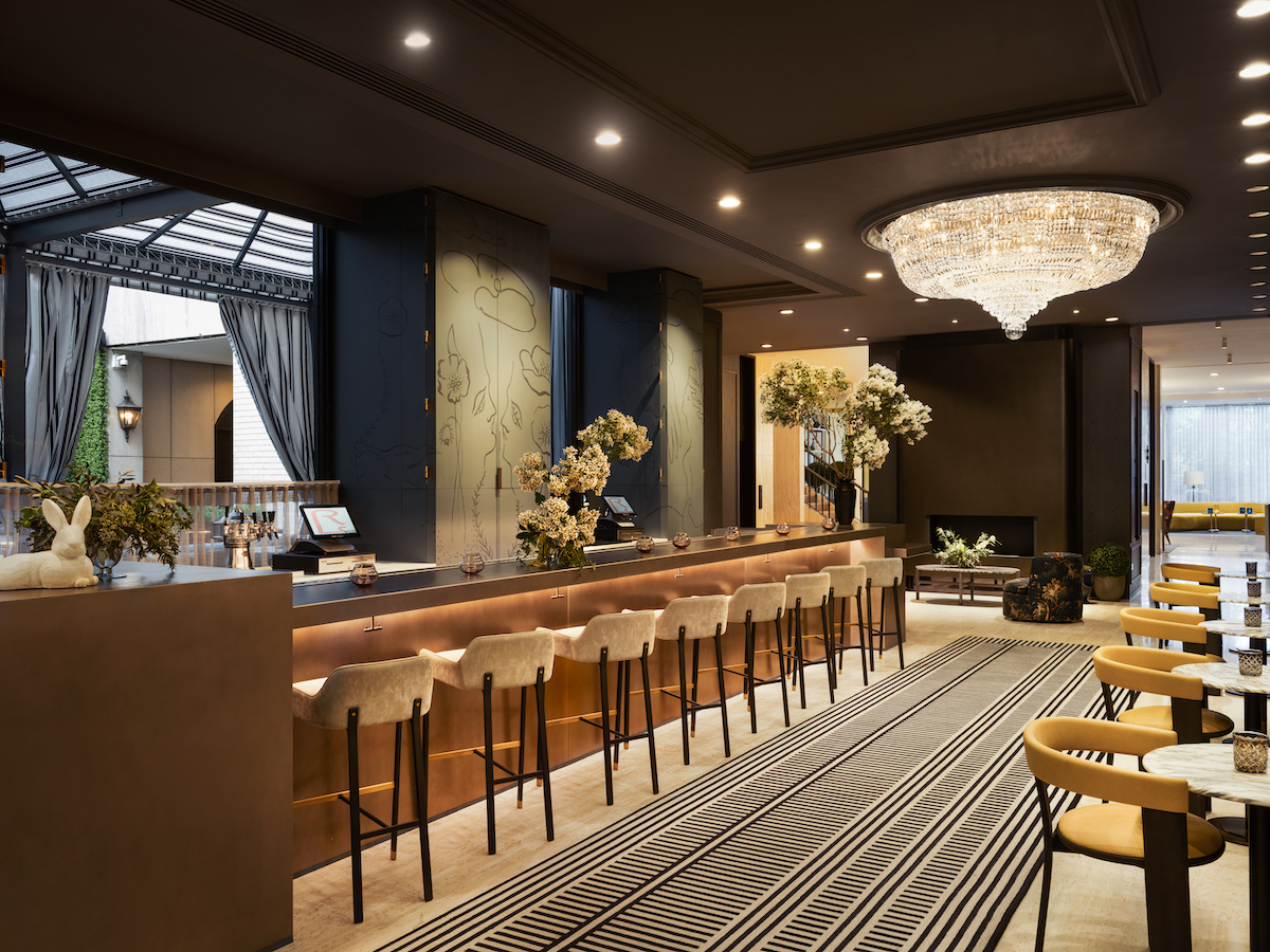
Image credit: Alice Gao
Harry’s New York Bar follows the similar dark, mysterious and sexy colour scheme as Rose Lane, but perhaps takes it even a step further. Masculine hues and materials such as deep navy blue, mahogany, two-toned marble, and velvet create the sophisticated finish. It feels old school and grown-up, especially with the help of the colourful art displayed on the wall and the textured and embossed ceiling.
Finishing on top, we find ourselves in the newly added rooftop bar, Darling, which has been conceptualised by LUCID. Transformed from an old penthouse residence, it has quite a different design language than the rest of the hotel. We welcome that, though, for a bit of spice and variation. The rooftop’s wrap-around terrace is covered, because at 47 floors it would be windy to say the least, but the solution is a black-and-white striped canvas roof which adds texture and intrigue to the space. This monochrome palette is contrasted by bright greens, warm oranges, and leafy patterns, complemented by lots of shrubs to create an energetic oasis.
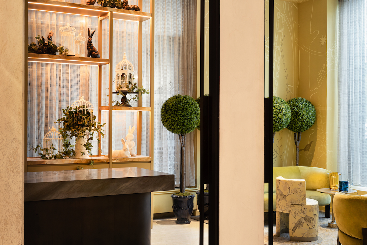
Image credit: Alice Gao
Nearby Central Park is yet again referenced throughout, especially via the greenery, but also via a giant and intricate mural on the staircase where guests arrive – bold colours, florals, and animals set the tone. The indoor lounge and bar area features a sprawling mural designed by artist En Viu, and continues the visual artwork thread of storytelling found throughout the property. Elsewhere, there are pressed metal ceilings, black-and-white floors, and panelled walls, all juxtaposed with rich coloured furniture, marble tables, and ornate lighting.
While the aura of The Park Lane’s past has managed to remain intact over the years, it became obvious that the spirit of the hotel was weighed down by dated interiors. To capture the magic and share the wonder of The Park Lane Hotel’s epic tale with the New York of today, the hotel was in dire need of a refresh. By remixing the original qualities and defining characteristics of Park Lane New York with spirited modernity allowed Yabu Pushelberg to reassert the hotel as a present-day landmark imbued with thoughtful consideration and elevated flair.
Main image credit: Adrian Gaut


