


Accessible Design in Hospitality: The role of paint colours, colour psychology, and neurodiversity
Creating welcoming and comfortable environments is essential in hospitality, where physical spaces greatly influence guest experience. Beyond service and amenities, paint colours play a vital role in shaping mood and inclusivity. Integrating accessible design principles that consider colour psychology and neurodiversity helps hotels become truly inclusive spaces for all guests…

Colour Psychology in Hospitality
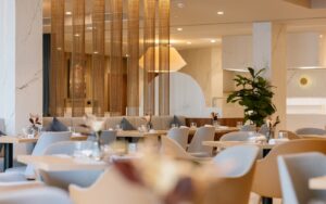
Colour psychology studies how colours affect emotions and behaviours. Warm colours like soft reds, oranges, and yellows evoke warmth and sociability, ideal for lively areas such as lobbies and restaurants. Cooler colours like blues and greens promote calm and relaxation, suited for guest rooms, spas, and quiet lounges.
However, these effects are not universal. Neurological differences mean colour responses vary widely. A one-size-fits-all approach risks discomfort or sensory overload, especially for neurodiverse guests.
Neurodiversity and Sensory Sensitivity
Neurodiversity includes conditions such as autism spectrum disorder (ASD), ADHD, and sensory processing differences. Many neurodiverse individuals experience heightened or diminished sensitivity to sensory stimuli, including colour and light. Bright, saturated colours or complex patterns can cause anxiety or distraction. For example, a brightly coloured, high-contrast lobby may overwhelm some guests with sensory sensitivities, while others might find overly vibrant colours distracting or disruptive.
Accessible Paint Palettes Inspired by 2025 Colour Trends
Paint colours set tone and mood, and in hospitality design, it is essential to balance aesthetics with sensory comfort while staying aligned with current trends. Keeping up with colour trends influences consumer behaviour by meeting guests’ evolving expectations for modern, appealing environments. Johnstone’s Trade’s 2025 Colour & Design Trends Book, Kinetic, offers a curated palette that supports accessible design principles while providing fresh, on-trend colours that hotels can use to create inviting, inclusive, and contemporary spaces.
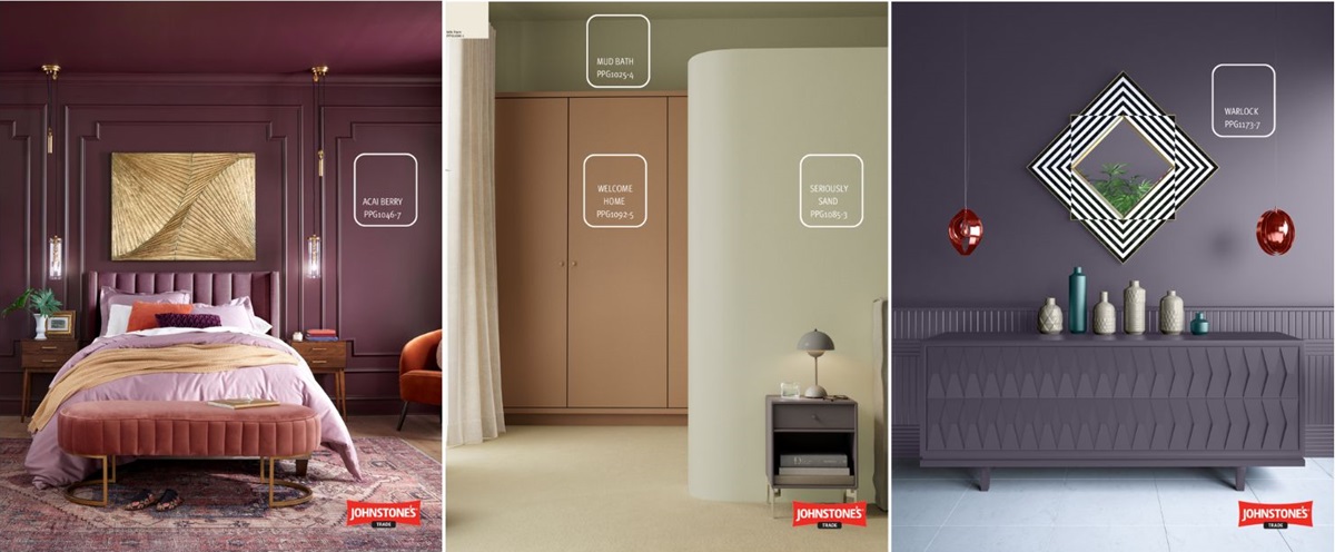
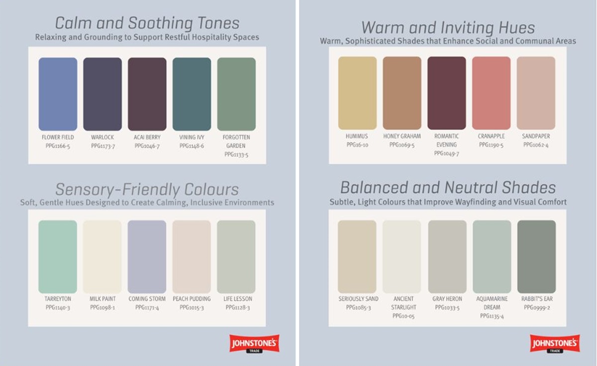
- Calm and Soothing Tones: Acai Berry (PPG1046-7), cosmic blues and purples like Stained Glass (PPG1165-6), and muted sage greens such as Forgotten Garden (PPG1133-5) promote relaxation and grounding.
- Warm and Inviting Hues: Terracotta and clay tones like Cranapple (PPG1190-5), muted mustard yellows such as Humus (PPG16-10), and warm greys like Shaded Whisper (PPG0995-1) add warmth and sophistication.
- Balanced and Neutral Shades: Soft greiges and dusty blue-greys like Rabbit’s Ear (PPG0999-2) and warm whites such as Ancient Starlight (PPG10-05) aid wayfinding and add brightness.
- Sensory-Friendly Colours: Pale lavenders like Coming Storm (PPG1171-4), soft peaches such as Peach Pudding (PPG1015-3), and creamy whites like Milk Paint (PPG1098-1) create calming, gentle spaces.
Implementing Colour with Accessibility in Mind
Colour choice alone is insufficient; finish and contrast matter. Matt and eggshell finishes reduce glare and reflections that cause discomfort or sensory overload, especially for neurodiverse guests. Matt finishes absorb light, minimising shine and creating a calming effect. Eggshell finishes offer slight sheen, durability, and ease of cleaning while limiting glare – ideal for busy hospitality areas. Moderate contrast between walls, trim, and floors supports navigation without harsh visual boundaries that cause disorientation. Highly saturated, neon, or glossy colours should be avoided as they can trigger sensory overload. Instead, colours and finishes should harmonise to support all guests’ sensory needs.
Expert Colour Consultancy Services for Hospitality
Selecting and implementing accessible colour schemes can be complex, requiring expert knowledge of colour psychology, neurodiversity, design trends, and regulatory standards. Our experienced team of Colour Consultants is dedicated to guiding hospitality providers through this process to create environments that are both beautiful and inclusive.
We offer tailored services including:
• Virtual and Face-to-Face Colour Consultations
• Colour Rendering Services
• Bespoke Colour Schemes
• Design Direction and Guidance
• Compliance and Resilience Support
By partnering with our colour consultancy team, hospitality venues can confidently implement accessible colour strategies that enhance guest comfort, support neurodiverse needs, and elevate overall design quality.
Don’t miss Hotel Designs’ live talk series Accessible Design Talks, where we cover a multitude of topics concerning accessible design within the hospitality sector. Our next talk will be held in Liverpool at our networking event MEET UP North, where we’ll be discussing ‘Accessibility Through the Lens of Neurodivergence’ with Tolù Adẹ̀kọ́ and Melissa Messmer.
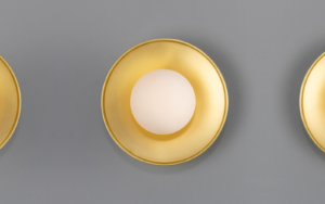
Main image credit: Johnstone’s Trade Paints