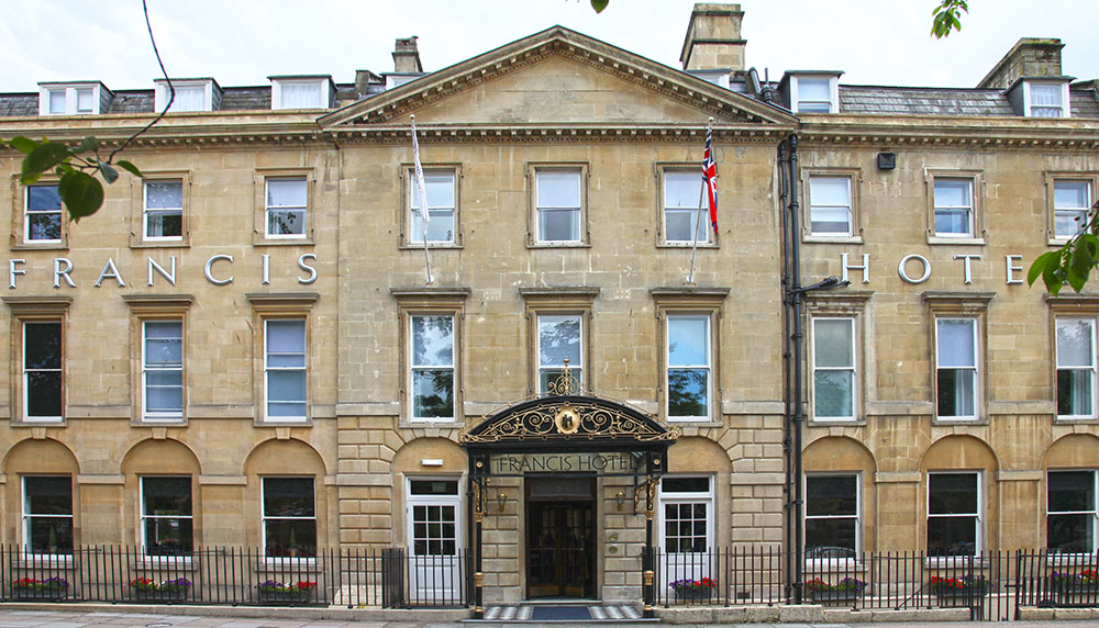
Aquae Sulis was the Roman name for this spa. The British of course are more ‘lumpen’ than classical, so called it Bath. It has been a resort town for millennia. Fittingly the Francis was built speculatively as a group of refined townhouses by John Wood the Elder, who lived in one of the houses, no.9. The terrace now forms the Francis hotel, no.9 the entrance lobby.
This has always been a wealthy part of the country and property prices in and around Bath are spectacularly higher than in most other parts of the country, in part due to the proximity of Charlie’s country home, but also because we tax payers have indulgently provided the chief of the Westminster chattering classes with a home nearby too. Both these have increased demand amongst the wealthier to live close by, presumably in hope of sharing a sherry occasionally. Into this wealthy town comes Accor, perceptively opening one of its new branded boutique hotels, an M Gallery, known throughout the area as the Francis, to serve both residents and the busy tourist market. The Francis is the chains second M Gallery in the UK, one of a growing number globally as Accor seeks to rework its brands which range from the luxury Sofitel through to the budget Ibis.
The Francis was first used for hospitality in the 1870s. The first owner, a Mrs Francis, moved from another hotel nearby, brought the remarkable canopy over the front door with her when she made it into a proper hotel (an early boutique perhaps) in 1884, converting it from its previous existence as a boarding house. The hotel obviously upset some German guests as they made a couple of return flying visits in the early 1940’s, leaving parts in ruins behind them.
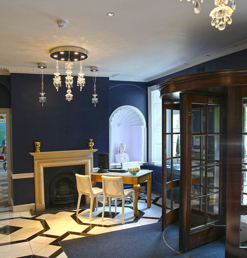
Reopened in the middle of the last century the hotel has now had a major makeover by Accor to the tune of some £6 million. Any refurbishment of a Grade 1 listed building in the UK has to battle a quagmire of regulation and supervision, frequently leaving the designers with conflicting instructions to resolve, energy conservation for example conflicting with a requirement to keep existing single glazed sash windows. Here the designers have acknowledged the history of the buildings throughout the project giving Accor a stunning property full of visual excitement. The theatre is strong whether the hotel is entered from the front door, or from the rear car park. The visual theatre is accentuated by the use of lighting and ornament, bespoke light fittings adding their drama to the rich chromatic palette the interior designer has chosen. This was a bold design strategy, using strong colour and pattern, but the designer has carried it off with consummate skill.
A rear lobby that might have been a dull entrance is lifted by skillfully lit niches echoing Rome with their busts. In the front the entrance drama comes from primary colour allied with a striking black and white floor patterning. The white concierge desk and red individual reception desks are discrete, allowing the space to flow well and providing guests with views into lounges either side. The one decision I would question here is the idea that the bar should be hidden. Already diners from the adjacent restaurant are getting drinks from the bar there rather than the hotel bar, and bringing them into the hotel lounge to drink. As the restaurant is an independent operation this is not good economics for the hotel. A large mirror on the end wall would preserve discretion in hiding the bar behind a wall, whilst still allowing its presence to be evident.
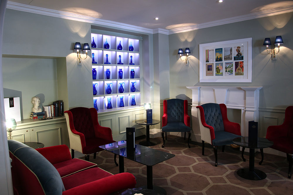
The bar lounge itself uses the history to effect with screens and wallpapers echoing period patterning. ‘Decadent’ light fittings drip crystal jewels and combine with colour to present the perfect sybaritic antidote to those bleak minimalist hotel interiors we have suffered from in recent years.
The main lounge on the opposite side of Reception continues the hotels’ tradition of afternoon tea as well as apparently operating as a lounge to the Raymond Blanc restaurant. The smaller bar lounge has a beautifully lit display of blue glass providing the man lighting drama. The slightly Georgian style wing chairs are upholstered in red and blue alternating fabric, which also provides some chromatic drama. Lighting is supplemented with wall sconces and table lamps. The enclosed nature of this space makes it less visible from the area anyway, but the glass mural screen completes its isolation from any sign of the demon drink.
There is a careful balancing act to listening to guests and measuring what they say about the commercial criteria for the operation. This is especially true when the guest profile is elderly but they often surprise by their acceptance of change, frequently being more open minded than the young. Whilst also often the elderly are perceived as resistant to change, here the contemporary take on the design has gone down well from my observation. I suspect the complaints about the bar were probably more to do with its previous style rather than anything else. I have never noticed the older generation generally having any particular resistance to alcohol consumption…
The entrance doors at the end of the lounge and the notice on the hotel’s website of the presence of Bistro Blanc generally suggests that there is a link between the two, but this is not the case. This leaves bookings for dinner for guests at the mercy of the manger of Blancs, and the hotel’s own restaurant just acting as a breakfast area, despite its size and position. It may be the kitchen is inadequate but I would have thought that if capable of providing breakfasts, the famous ‘full English’, then like any other operation it can provide guests with a basic bistro operation as an alternative should Raymond Blancs be fully booked. This is quite possible in Bath where some restaurants are apparently booked five months ahead. My experience of Mercures is that they do not provide a full meal service and perhaps Accor intends for this to continue with its ‘M’ Gallery operation?
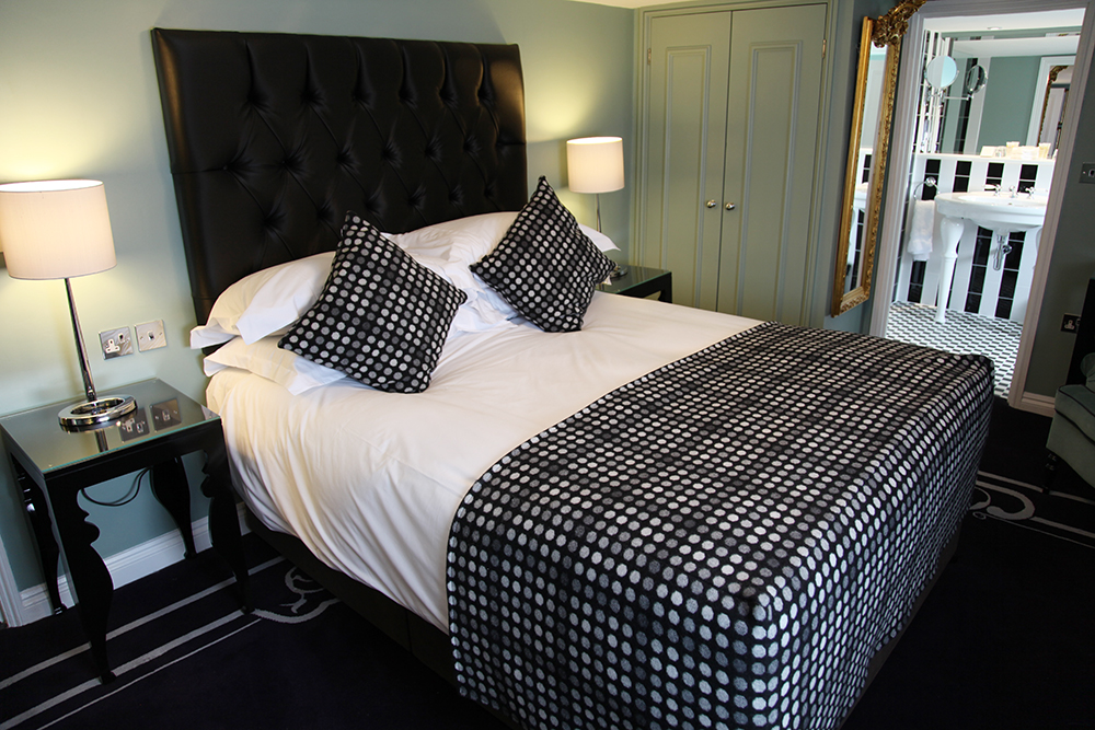
Whatever the operational mismatch, the design sings. The architectural layout has been revised but the colour and pattern bring it together.
With the original hotel being the merger of a number of buildings, the architects and interior designer have honoured the pattern with each house warranting a different colour scheme in the corridors. Plaques mark each building internally. Whilst the ground floor schemes attempt quite successfully to evoke the era that saw the glories of colour and pattern in such interiors as those of Brighton Pavilion, the bedrooms and bathrooms strike a very modern note.
Bold carpets in solid colour with strong borders are complemented by black lacquer beds. The solid colour is a risky approach as pattern can hide a multitude of spills and splashes, whilst solid colour does not, but visually it is strong. The walls are painted but in some rooms there are line drawings depicting Bath – run off as digital wallpaper prints and showing the versatility now available to the designer. Colour combinations are bold and harmonious, an are used in some rooms to revamp the fitted wardrobes installed by the previous operator. Strong colour and careful detailing such as the use of chrome switch plates and black lacquer for the bedroom case-goods add to the drama. Yet the whole effect is quite restful. So much so the designer has added a picture to the ceiling for you to look at as you relax…
In keeping with many British hotels the sash windows open as there is no air conditioning. This is the case in many British hotels where the view is that it is only needed for 14 days of the year. Certainly in an historic building like this introducing a system is difficult, if not impossible. The rooms have good proportions and all are en-suite, despite the difficulties in running the services that must have been experienced in an earlier build. A word of warning to all designers; glass tops on work desks stop computer mice working as the glass refracts the light the mouse needs to track with. Frustrating for a business man trying to work out why his mouse cursor is not moving. A return to grubby mouse mats perhaps – I hope not. Here the desk is a good size with ample sockets. There is also a table and two easy chairs so it is easy to see how with full meal service this hotel could easily become a five star experience.
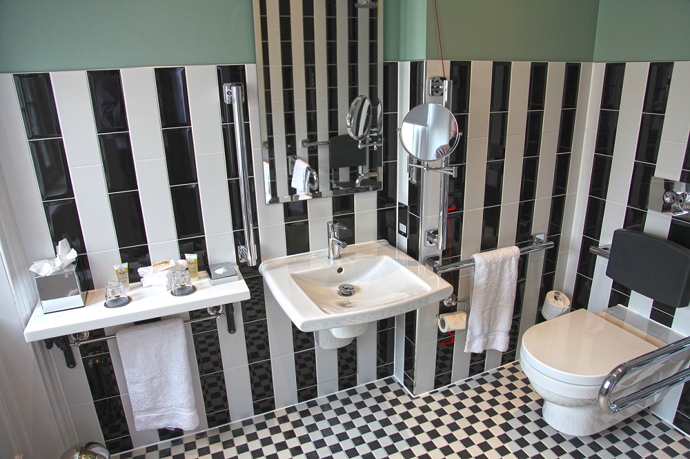
The bathrooms too are well designed and behind all the baths and showers is a large mural image of the Roman baths, located in their original form an easy walk from the hotel. Showers are both rain head and a hand unit. The powerful showers throw out a large volume of water. This in turn causes a problem in that the extract is unable to cope, leaving the room dripping as the steam condenses out on the walls and ceiling. Fortunately most bathrooms have opening windows, but either more powerful fans or an additional extract might be needed to provide a solution.
Baths are standard European baths boasted of in the US as being a ‘soaking tub’. The large wash stands give a sense of additional style as well as harking back in style to an earlier era. This is all a part of the designers consideration all the way through the project of reminding the guest subtly of the history of the building. This is, in my view, a glorious refurbishment only marred by some curious operational decisions. However, if an indicator of the general quality Accor are to achieve throughout their new ‘M’ Gallery brand, it will provide serious competition in the boutique hotel market.
All words and images are ©Patrick Goff. From a visit made in July 2012.

