As one of the first of Hilton’s new Motto brand properties to open, this project in one of Manhattan’s most vibrant neighbourhoods sets a standard for those to come. We stepped inside for a closer look…
A short walk from architectural icons like the Flatiron Building and the High Line, the 374-key Motto New York is sheltered inside a 42-storey structure by Stonehill Taylor, the New York City based firm that has also designed the hotel’s interiors.
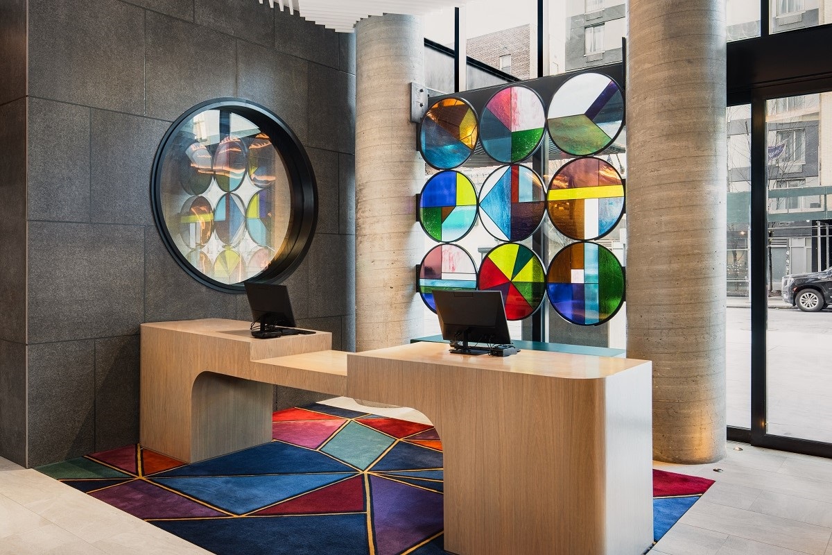
The setting within a former theatre district and current arts district inspired the use of unique art installations and dramatic arches in The Motto New York’s public spaces and guest rooms. However, it was the venue’s 24th Street address that acted as the main design muse, as Stonehill Taylor used the number 24 and its significance in different contexts as a spark for the hotel’s colour scheme, furnishings, finishes, and artwork.
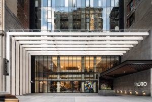
Image credit: Motto by Hilton / Joe Thomas
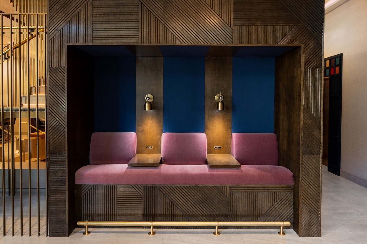
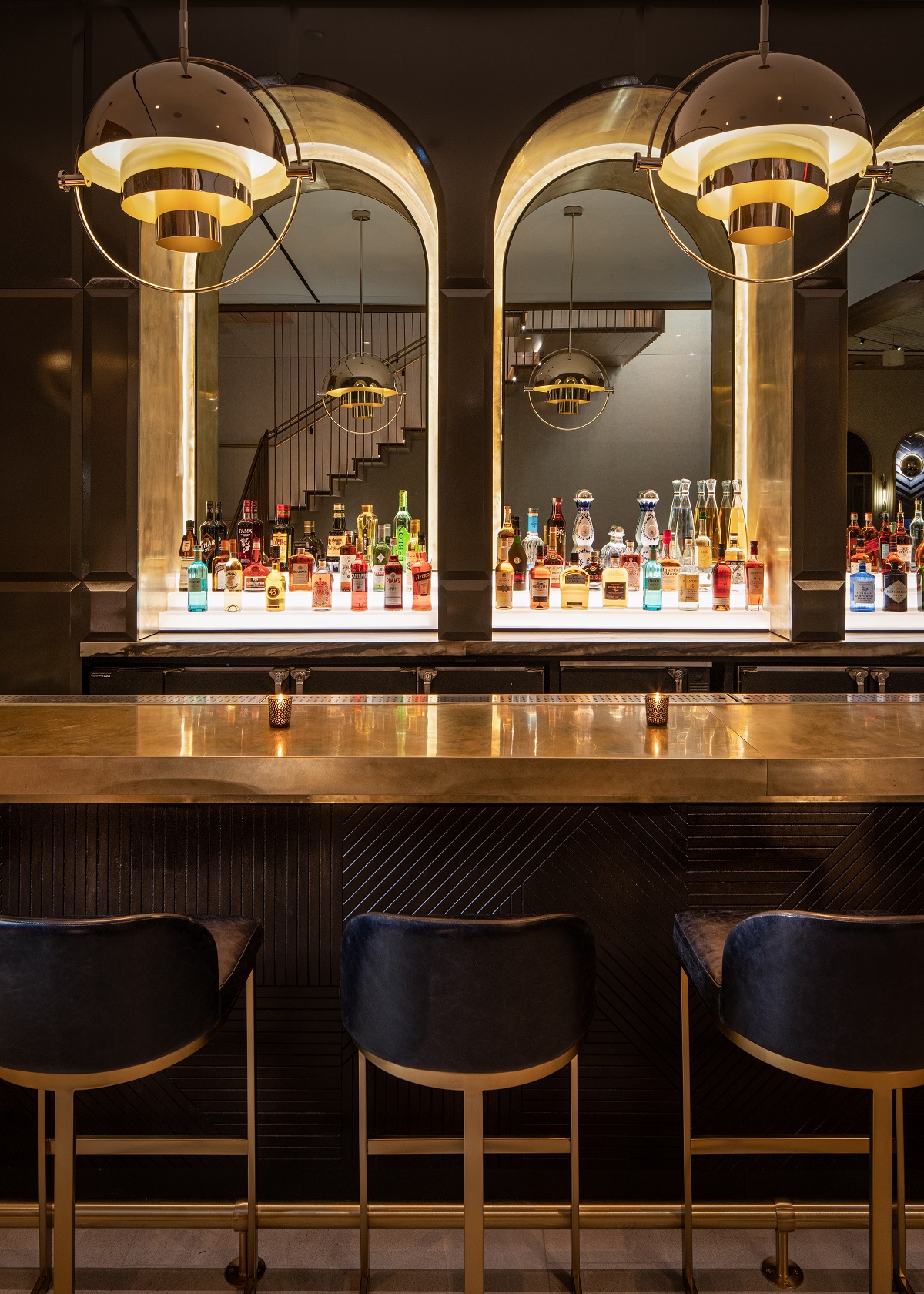
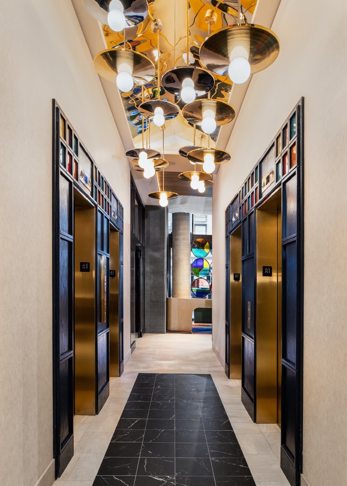
The ’24’ design concept is highlighted by way of three unique concept pillars. The first, the 24 hours in a day, takes inspiration from the passage of time, the sun, the moon, and the contrast of light to dark. In military time, 2,400 signifies the midnight hour, which the firm wove into the hotel through accents of deep midnight blue. The second 24-ism references metals, in particular 24-karat gold and chromium, the 24th element on the periodic table. Stonehill Taylor’s team incorporated these finishes in a unique yet cohesive way in light fixtures, case goods, and artwork. For the third and final concept, the designers looked to 24-bit colour, a means to produce colour digitally in its truest form, which resulted in concentrated moments of vibrant jewel tones carefully curated throughout the hotel.
- Image credit: Motto by Hilton / Joe Thomas
- Image credit: Motto by Hilton / Joe Thomas
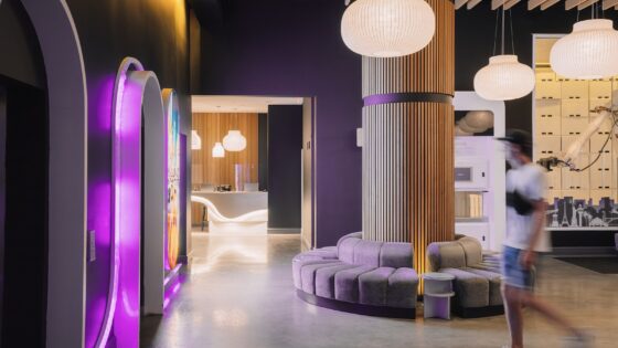
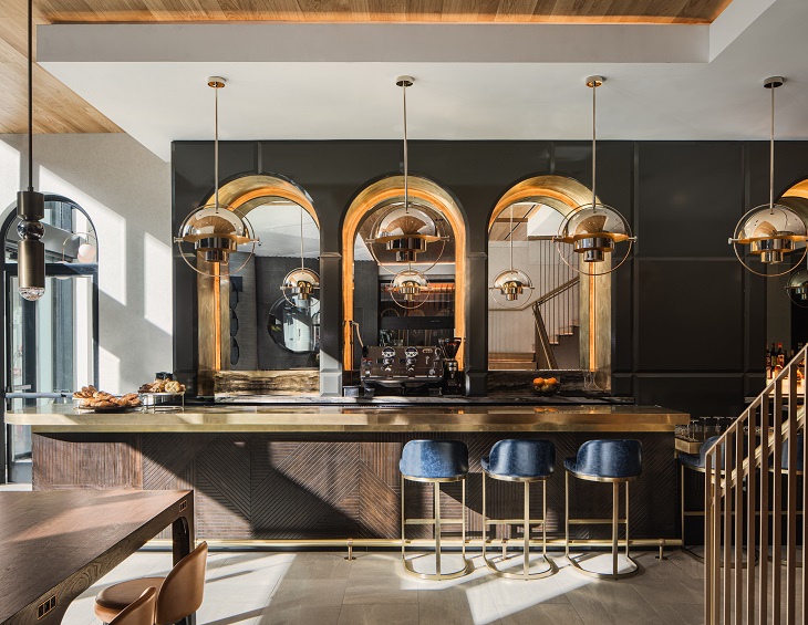
Stepping inside you are greeted by multi-coloured panels hung in a kaleidoscopic ceiling installation. A jewel-tinted stained-glass screen, inspired by the phases of the moon, provides a vibrant backdrop to a clean-lined reception desk. Moving into the food and beverage area, gold and midnight blue elements define the space in a skylit F&B space located along the ground floor’s eastern edge. Gold velvet-upholstered chairs saddle up to walnut tables, and back-lit midnight-hued velvet and leather banquettes adjoin the walls. Located centrally on the ground floor is a dramatically sunken day-to-night conversation pit for working or lounging by the main bar. A suspended lighting installation of glowing multi-coloured glass globes climbs its way through the brass-railed feature stair to the second-floor lounge, where an over-sized mixed metal wall sculpture greets guests at the upper level of the stair. There, a well-appointed lounge area can be found with welcoming and stylish furnishings atop jewel-toned area rugs and a bar with a midnight blue mosaic tiled wall, softly lit by glowing brass and chrome mirrors. All these elements clearly showcasing different aspects of the design narrative.
- Image credit: Motto by Hilton / Joe Thomas
- Image credit: Motto by Hilton / Joe Thomas
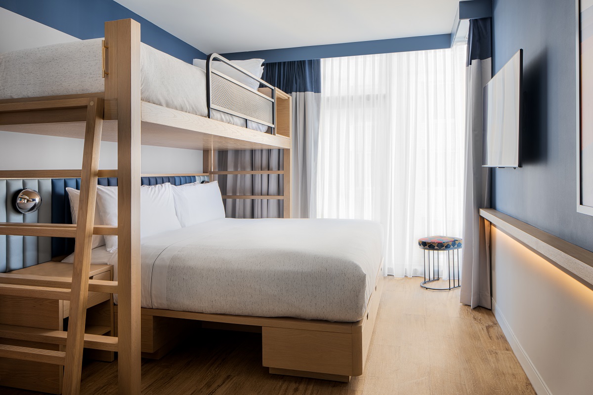
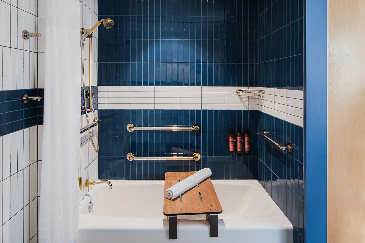
A restrained but distinctive design scheme characterises the guestrooms. These compact yet smartly appointed spaces feature furnishings that make maximal use of available space. Platform beds have channel-tufted headboards in a light-to-midnight-blue ombre, as well as built-in storage. Contrasting midnight-blue and white colour blocking appears on the tiled walls in the bathroom, highlighting brass and chrome fixtures. In both the guestrooms and corridors, the designers have carefully curated a selection of artworks recalling urban elements of New York City, whether through colourful graphics or striking photography. Guestroom corridor wallcoverings continue the contrasting blue and white concept with a carpet design that explodes in a prism of colour. In addition to traditional king and double guestrooms, the Chelsea Motto offers a unique three-bay plan, that includes a “king bunkie” option – a king bed with a twin bed above it.
- Image credit: Motto by Hilton / Joe Thoma
- Image credit: Motto by Hilton / Joe Thoma
From the striking Motto green entry doors through to the lobby, public spaces and finally the guestrooms, the story behind the design concept has been considered at every step and in all the details. The finishes, fixtures and installations are all part of a cohesive project that reflects the neighbourhood that shelters the latest addition to the Motto by Hilton brand.
> Since you’re here, why not find out more about the brand Motto by Hilton?
Main image credit: Motto by Hilton/ Joe Thomas

