Think of this element of the Guide to Hotel Design as the troublesome classmate – you know the one – who finds pleasure in going against the lecturer’s every word. In this smug and creative feature, Charlie Svensson explores the loopholes that allow designers and architects to break the rules…
Interior design, just like any art, is part intuitive and part rational. This means that half of the work of an interior designer is studying the geometry of the space. The designer keeps some conventional rules that help achieve an aesthetic room in mind. So, measuring the space and choosing furniture that’s proportional to it is a first step, along with choosing a colour palette. But the interior expert also avoids certain textures, methods, and furniture based on those underlying rules.
Nevertheless, some designs don’t look right even if they tick all the interior design laws. The eye and our taste aren’t always perfectly in line with geometry’s strict policies. Therefore, the other half of the designer’s work should be breaking some rules in favour of an ‘unexplainable’ visual pleasure. The transgression of these rules can offer character to a room and make it feel more ‘at home’.
Here are seven interior design rules that you can strategically break to elevate your space.
1) Symmetry
One of the essentials of interior design is symmetry. While most of the time symmetry can make a space seem clearly structured and organised, it can also make it dull, flat, and generic. Experts will often suggest two identical bedside tables, two identical picture frames centered above the bed, and so on. But the last thing anyone wants is something that seems like a furniture showroom.
Moreover, symmetry isn’t always a wise choice for rooms with asymmetry. Maybe the room isn’t a square, and it has a protruding wall or some other peculiar feature. In these cases, symmetry doesn’t suit the geometry well. So, when you choose your furniture or decor, think twice before choosing plain symmetry. Try to play with different elements and see how it looks. Remember that a healthy dose of asymmetry can break the monotony of the room, making it tridimensional and dynamic.
2) Matching decor
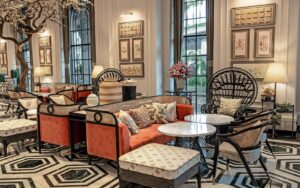
Along with symmetry, many designers keep it safe and pick matching decor: if the wall is beige, all the decor is beige. The result is a two-dimensional space that feels sterile and monotonous. Hence, you should try and mix patterns, textures, and colours, not just shades of the same grey.
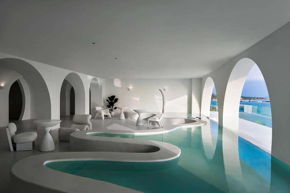
Image credit: GS Design
For instance, you can choose an eclectic style that mixes modern furniture with bold and detailed antiques. Sure, it’s challenging to find an equilibrium between radically different styles. Nonetheless, the result can be stunningly chic.
The key to success is choosing the decor pieces that have a different style but tie in with the colour palette you chose. Otherwise, you can select a similar style in a different texture. The elements should relate to each other somehow while bringing some visual interest to the table.
The perfect example is mixing old with new: the sofa, the walls, and modern decor. Meanwhile, the artwork, the drawer, the lamp can interest and a sense of industrial vintage. Lastly, everything can be tied together by a selection of warm colours.
3) Matching metals
When it comes to bathrooms and kitchens, matching metals is common. But this obsession with making everything identical turns spaces into cold-feeling rooms. If your bathroom has a spa aesthetic, you might add golden accents to spice up the space with bamboo furniture and a wooden floor. Play with options and find what looks appropriate.
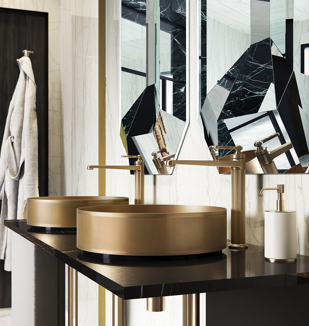
Image credit: Gessi
4) Small furniture for small rooms
A common misconception in interior design is that furniture needs to be perfectly proportional to the room. This way of thinking often leads to having a room that looks heavy, cluttered or both. The key is to remember the importance of the room’s ‘weight’, not the size. So, pick three main items that take up volume.
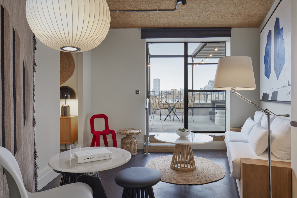
Image credit: Lore Group/One Hundred Shoreditch
The furniture should be moderate: a queen-size bed for a small room, a four-person sofa for a medium-size living room. Or you could make one of these main items more dominant. For instance, a small living room can become a sofa room with two big sofas that take up a lot of space. To balance it out, designers may want to try to reduce the number of other elements in the room.
5) Bold colours only the accents
One of the most famous interior design fact is ‘light colours widen the space’. So, many people are often scared of bold and/or non-conforming colour schemes, even in large rooms. Sure, painting the walls in navy blue might not be the best for a living room, but it can add layers (and personality) in the bathroom.
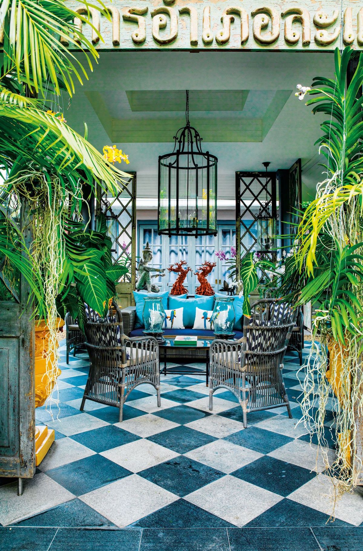
Image credit: Bill Bensley
The winning card is picking your style. Maybe you’re trying to achieve formal, or industrial, or urban jungle. Establish the furniture and decor that works. Then, figure out if a wall could bring out those elements. For instance, if you’re going for Parisian chic decor, you might use a lot of white furniture. In this case, a dark grey wall can bring out the decor and tie everything beautifully without making the room feel small, heavy and cluttered.
6) Avoid faux plants
Green elements, such as plants and flowers can elevate any space. They can add a bit of colour and make the room lively. But real plants can become a burden when it comes to upkeep (especially in hotels) to take care of plants – and there are some great faux plants that are also sustainable.
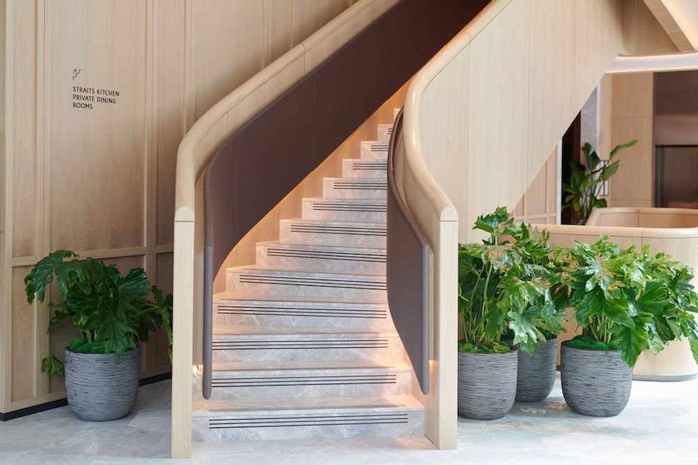
Image credit: Pan Pacific London
Sure, they’re not the real deal, but they can come in handy when you travel a lot, for example. Also, you can use them in combination with real ones. This way, you get the same effect without more work.
They’re also great for outdoors because they can stay green all year round. Just make sure that you pick the ones that look real and preferably made from recycled materials.
7) Walls should never match the floor or ceiling
Previously, we mentioned that symmetry and matching everything isn’t always the best choice. This time, matching the floor or ceiling to the walls can give off a luxurious look to any room. Again, this needs to be planned carefully beforehand, but your room will seem tailored if you decide to go with it.
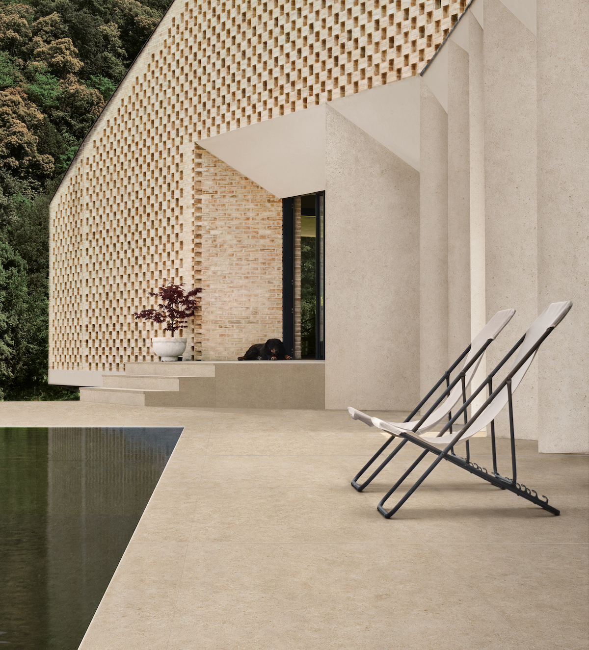
Image credit: Atlas Concorde S.p.A
Generally, eclectic rooms with many decor and textures benefit from matching walls and ceilings because they add a sense of continuity within the room. Nonetheless, keep your style in mind before making a decision.
> Since you’re here, why not read about creating a cohesive design language between bedroom and bathroom?
Main image Unsplash


