As the first Ned to open in North America, Soho House Design collaborated with Stonehill Taylor on the interior design and architecture of the members’ club and hotel, The Ned NoMad. Influenced by the sensation of the Swinging 50s and 60s glamour, the inspiration of the design comes through the space. We stepped inside the beautiful Beaux-Arts building to have a closer look..
The Ned NoMad’s design concept was broken down into three pillars. Originally erected in 1903, the Johnston Building serves as the first pillar. The building was female-owned, which was rare during this time period, and boasts a beautiful limestone façade, a glamorous and expensive finish for the 1900s. A second pillar is the building being a storefront and office for an array of different disciplines in the 1920s, from construction, power, and electrical to publishers, textiles, and embroidery. The Golden Age of Music is the third design pillar, dating back to the 1920’s glamour and the Tin Pan Alley era of music, drawing on a wealth of different periods in time, and combining various cultures, sounds and styles, continuing to evolve into the 1950s and 1960s.
Architecture and Interior Design firm Stonehill Taylor have a history with this building having previously converted the Johnston Building, from offices and wholesale shops to the famed NoMad Hotel in 2012. To honour the historic property that was built in 1903, original architectural features and details are prominent and serve as decorative elements that inform the interior design. To brighten up the spaces and provide visual continuity, new lighting was incorporated as well as several new custom-made mosaic floors.
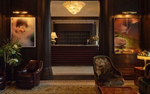
Image credit: The Ned NoMad
The reception area celebrates the space’s original and intricate ceiling features while blending the Beaux-Arts style with a classic feel. Paying homage to the building’s past, the design team kept the original flooring in the reception area. This space is decorated with vintage pieces, and the embossed leather pattern on the reception desk is reminiscent of the Manhattan street grid. Rich oak panelling with burl inserts contrast against polished plaster on the walls and ceiling. Inspired by the natural world and William Morris’s Arts and crafts, the space has been designed with chandelier lighting featuring glass shaped like leaves. The sheer café curtains create a sense of mystery from the outside, while William Morris designs hang in drapery, adding an element of playfulness against the darker timber panelling.
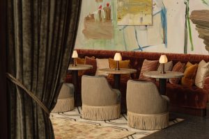
Image credit: The Ned NoMad
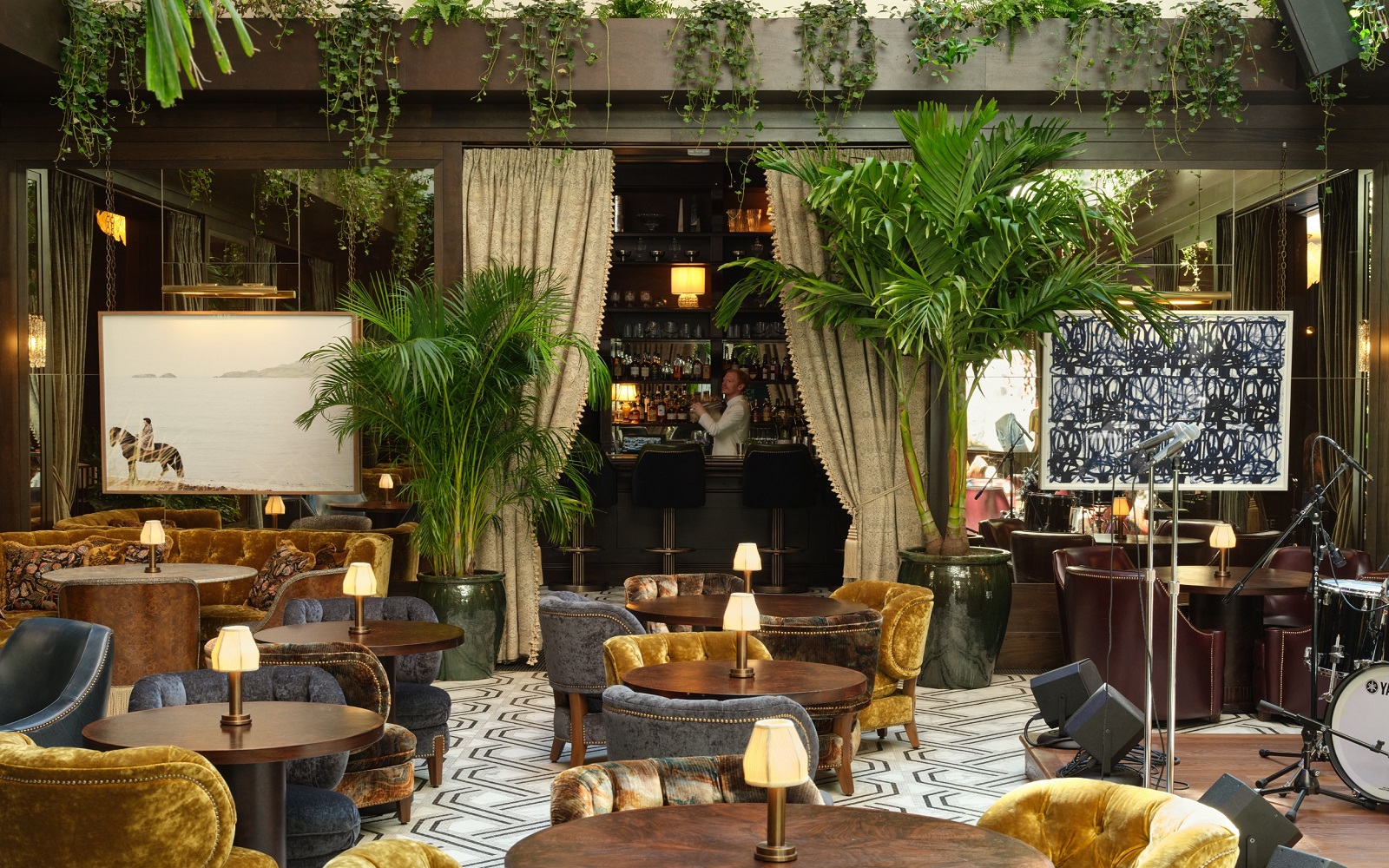
Located on the first floor adjacent to the hotel’s reception is the Ned’s Club Downstairs, a members-only place to eat, drink, socialise and relax. As members make their way to the Atrium, they are pulled in by a striking monochromatic mosaic floor, boasting a strong woven design
inspired by Art Deco pattern-work. Wood panelling continues from the reception area and features bronze antique mirrored inserts, reflecting light and creating a shimmering, glamorous central club space. Centered around a stage underneath the Atrium, members can enjoy live entertainment in the lounge every night. A smaller section of the club, known as ‘The Snug’, features a custom wall mural, reminiscent of the New York City sunset colours, and surrounds a fireplace sourced from a French chateau.
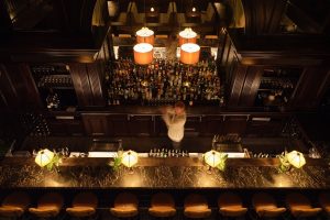
Image credit: The Ned NoMad
As an original and beloved NoMad Hotel feature, the design team kept the NoMad Hotel’s Elephant Bar, stripping back the old dark panelling and replacing it with a lighter grey-blue polished plaster wall finish. Ned’s Club areas include the Club Bar, which is adjacent to the lounge, and the Library, a much loved feature of the original NoMad, a members-only quiet workspace by day and bustling bar by night. Completely transforming the space, the original floor has been stained darker creating a richer base, and the original dark timber shelving has been refreshed with an iconic sage green paint, reflective of the Ned’s signature green hue. The original LED lighting has been removed and
replaced with modern table lamps, first edition books of which many came from the library collection at The NoMad, and accessories to style the shelves. Furniture styles throughout the space reflect pieces from London’s Ned with shimmering marbled velvets and rich, deep oak
furniture pieces and vintage rugs that create a perfect ambiance for working and socialising.
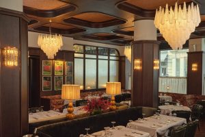
Image credit: The Ned NoMad
Inspired by the “Mad Men”-era, Ned’s Club Dining Room, a members-only restaurant adjacent to the lounge, features a slightly toned-down version of the Ned aesthetic and a Don Draper-style environment for socialising all day and night. The dining room has a glamorous 1960’s feel with dark finishes and curved coffers, reminiscent of Italian design. Panels of stained glass, with luscious hanging ivy and jasmine, are inspired by the restored storefront and pull in the city skyline. Green fluted leather dining chairs are beautifully accompanied by dark floral banquettes
and burl wood tables, lit by oversized Murano glass pendants. The members’ restaurant is designed with lush, floral upholstery fabrics that are residential in feel, and wrap the perimeter seating in the space. The ceiling has been designed with mid-century form and fabric panels to
soften the room. Striking grand crystal pendants hang from the ceiling while sheer café curtains provide privacy from 28th street and are held up with aged brass custom made curtain poles. For a moodier and dramatic feel, the central columns are wrapped in hexagonal panelling.
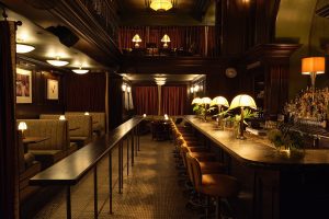
Image credit: The Ned NoMad
Little Ned, a small bar space, features a first floor that is accessible to members and hotel guests, while the mezzanine level is for members only. The design team kept the existing floor that resembles the reception area. Little Ned has 1920s style booth seating with upholstery details
carried over from the Ned London, finished in William Morris design and rich ‘Ned green’ velvet piping. Soho House Design and Stonehill Taylor added touches of new upholstery, fresh and more vibrant colour tones, and slightly more contemporary case goods to connect with the Ned NoMad’s aesthetic. The mezzanine upstairs boasts views of the Empire State Building and is equipped with Art Deco vintage furniture pieces.
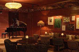
Image credit: The Ned NoMad
On the second floor is one of the club’s most striking spaces: the Magic Room, an intimate, members-only events space. The interiors play off of Art Deco 1920’s cabaret clubs with a stage and windows looking out to 28th Street on tin pan alley, bringing music back to this street during
the shows. This room is now painted a striking red colour with an eye-catching marbled wallcovering paired with cosy club chairs. Sitting at the back of the room is the bar, designed with solid stone, silk lampshades and antique brass framework. Attached is an outdoor terrace for
further seating with petite Murano glass lanterns overhead. Ned’s Club Upstairs includes a rooftop lounge and an outdoor terrace designed with a colour palette inspired by the New York City sunset, providing a lighter feel from the deeper spaces and colours of the lower Club floors. The interior spaces blend together pink polished plaster walls with rich golden upholstery tones, florals, mosaics, rich burl woods and Breccia Capria stone. Transitioning outside to the main roof terrace, the area is designed with a classic check stone floor. The fresh golden florals contrast against richer plum tones, cast iron, and stone tables. An array of largescale beautiful greenery in traditional, aged plant pots beautifully ties the space together. The roof includes a mix of seating for eating and drinking while looking out to the striking views of the city
skyline. There is also an exclusive private dining space in the Cupola, the main feature of the Johnston Building, standing above the exterior as a beacon with a grand vintage chandelier.
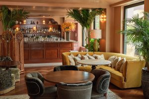
Image credit: The Ned NoMad
Situated on the first floor to the left of the main entrance and open to the public is Manhattan’s first Cecconi’s restaurant, a sister restaurant to the Dumbo, Brooklyn location. Inspired by the restaurant’s signature style stripe, the design team created a custom floor with a mix of multicoloured Italian, palladiana style terrazzo insets, flanked with hand-chipped black mosaic, which pays homage to the original Johnston Building mosaic floors. The overall design concept is inspired by traditional Italian Trattorias, resulting in a light neutral gloss stepped ceiling and a gloss burl wood bar front. As guests enter the restaurant, they are welcomed by an aged iron Crittal style glass wall, reminiscent of an Italian villa garden. Upholstery styles are similar to the Ned London’s Millie’s banquettes and are mixed with classic Cecconi’s dining chairs. Striped linen columns are set against navy velvet banquettes, golden-yellow leather chairs, and a polished burl timber bar. This space also features wood-paneled walls, panels of stained-glass inspired by an old storefront, and a custom-designed curtain in William Morris fabric.
Main image credit: The Ned NoMad


