Tonje Odegard checked in to the newly opened Moxy NYC Lower East Side to discover what industry titans Michaelis Boyd, Rockwell Group and Stonehill Taylor have managed to rustle up for one of this vibrant and fresh-faced hotel group’s latest instalments…
There is so much to talk about when it comes to the interior design choices inside the recently opened Moxy NYC Lower East Side, and it’s all positive. I mean, what can you expect when you have some of the biggest talents in the industry coming together, working their magic in perfect harmony? With the help of interiors by Michaelis Boyd Asscoiates for the guestrooms and public spaces, Rockwell Group’s touch for the F&B outlets (in collaboration with Tao Group Hospitality it’s worth noting) and architecture by Stonehill Taylor, The Moxy NYC Lower East Side was ready to open its 303 guestrooms to the public in October 2022.
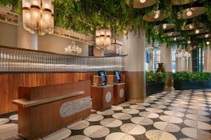
Image credit: Michael Kleinberg
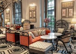
The hotel really is impactful from the moment you enter its foliage-covered catwalk hallway, beautifully lit by natural light from the floor-to-ceiling windows. The monochrome tiled floor depicts circular shapes, which are revisited in large brass-clad industrial ceiling lamps, a theme that carries through into the lobby. The tone for the hotel is immediately set – the markings of a good lobby in our opinion). It is edgy yet elegant, playful yet at the same time sophisticated. It’s an energy that very much mirrors the vibe of Lower East Side itself, where Soho, Nolita, Chinatown and the East Village meet.
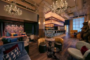
Image credit: Michael Kleinberg
Playfulness makes its appearance in bold colours and vivid patterns, but also eye-catching artefacts such as a large brass bear dancing with a hula-hoop, or 3D-printed pinup girls hanging from the crystal chandeliers in acrobatic poses. I met with General Manager Leo Glazer who told me more about the neighbourhood’s history, which helped inspire the hotel’s style. For instance, he told the tale of how the hotel’s grounds used to be home to large German winter gardens in the 19th century, which has inspired the extensive usage of foliage, and how the area has a rich history of vaudeville theatre, art, burlesque houses, and circus performance – hence the hula-hooping bear and acrobatic dolls!
Elsewhere, the lobby is interactive and equally laid-back, encouraging socialisation and play. The seating is all movable, so people can gather in smaller or larger groups as they see fit; there’s a shuffleboard; a giant marble bar with an overhang of fluted glass and brushed brass serving coffees and cocktails throughout the day; and a Pac Man table in the meeting space next to the lobby – to conclude, it’s a multipurpose amusement space.
“Functional spaces are key, but we want them to be fun and interactive, because Moxy is all about fun,” explains Glazer. “Still, what lies as a foundation for all of it is how design can enhance the guest experience and to change the narrative of what a hotel could and should feel like for the people staying here.”
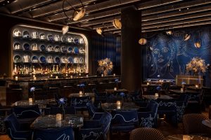
Image credit: Michael Kleinberg
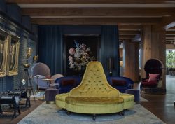
Part of that mission is changing the lobby-level space to something more than just a check-in spot. The immersive and vibrant elements in the lobby bar contribute to this, of course, but so does the late-night live music venue right next to it; Silver Linings is a stylish and sophisticated bar lounge inspired by Andy Warhol’s New York haunt The Factory, famous for its 1960s parties and often referred to as The Silver Factory. The custom-made lounge chairs with fine-line drawn abstract faces are particularly eye catching and they fit in nicely in the colour palette of blue, black and gold, with touches of silver.
Throughout Silver Lining, Michaelis Boyd chose materials that are both luxurious and nostalgic, including the herringbone-patterned wood flooring, glimmering chrome and nickel, plush velvet and the slightly rough, pitted surface of the bar.
Let’s move downstairs to the hotel’s restaurant, Sake No Hana, situated in the basement. The entrance to the hotel is sat on a corner, and it is in this space in particular that you can appreciate the clever use of that; you enter downstairs to the restaurant through circular staircases made up of metal, glass and leather on either sides. Guests arrive to a double-height entrance area that instantly transports them to Japan. The circular bar again counteracts the angular features of the corner space and giant Japanese kimono-inspired tapestries help soften the room further. In fact, there are a lot of textures and layers throughout in the design details, wallpapers and decorations.
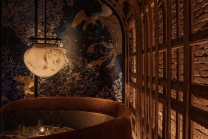
Image credit: Michael Kleinberg
The restaurant itself is dark and moody, with dim lighting that makes for a sensual atmosphere. It is voyeuristic and inviting, keeping up with the Japanese theme through cherry blossoms, round lanterns, blush colours contrasted by a black backdrop, specs of reds, tassels and mirror ceilings – it’s truly a magic space with food to match.
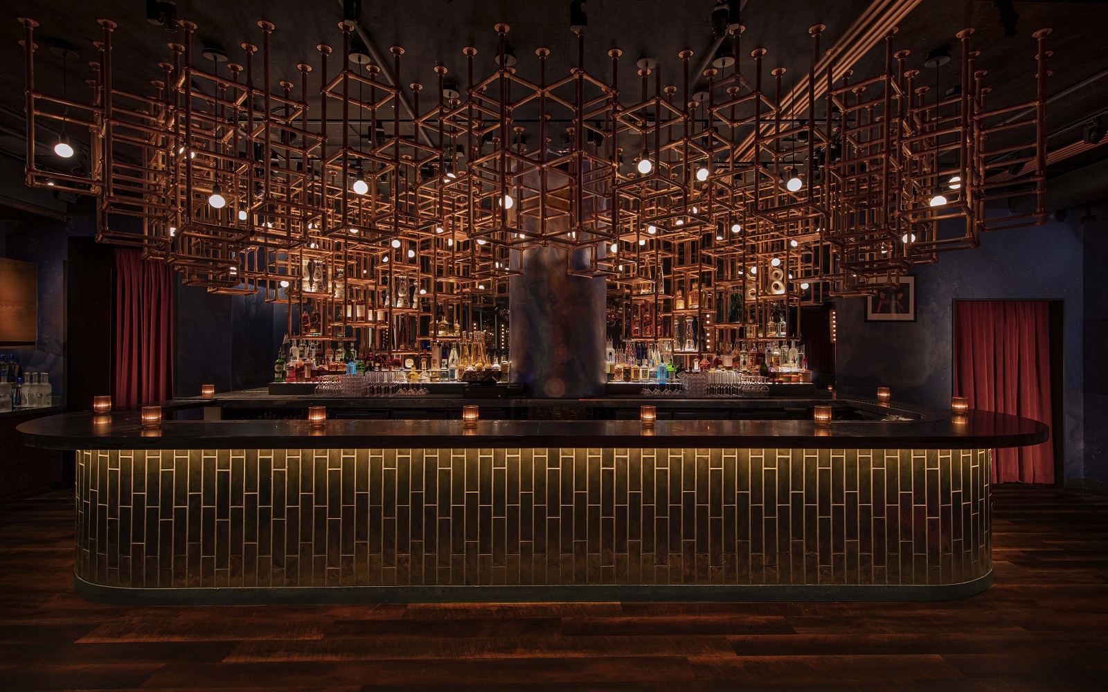
A further level down is where we find the hotel’s nightclub, Loosie’s, an intimate party space with dozens of sparkling mirror disco balls scattered across the ceiling in an epic chandelier formation. This is a real downtown hangout attracting an eclectic and hip crowd from the neighbourhood.
“The history of Moxy Lower East Side’s surroundings as an incubator for live music, performance, and art inspired Rockwell Group’s designs of Sake No Hana and Loosie’s Nightclub,” said Shawn Sullivan, Partner, Rockwell Group. “We spent a lot of time thinking about how to mark the transitions from the hotel to the restaurant and club, which are in the cellar and sub-cellar levels. Guests enter Sake No Hana via two curved staircases, flanked by double-height kimono-inspired tapestries, that descend from a catwalk in the hotel’s lobby. The entrance feels very grand and theatrical, as guests take in the installation and move to the bar and dining room beyond. An alley leads to Loosie’s further below, referencing the ‘back houses’ of the Lower East Side that attracted artists in the 20th century. The building may be new, but the experience takes you back in time in the neighbourhood.”
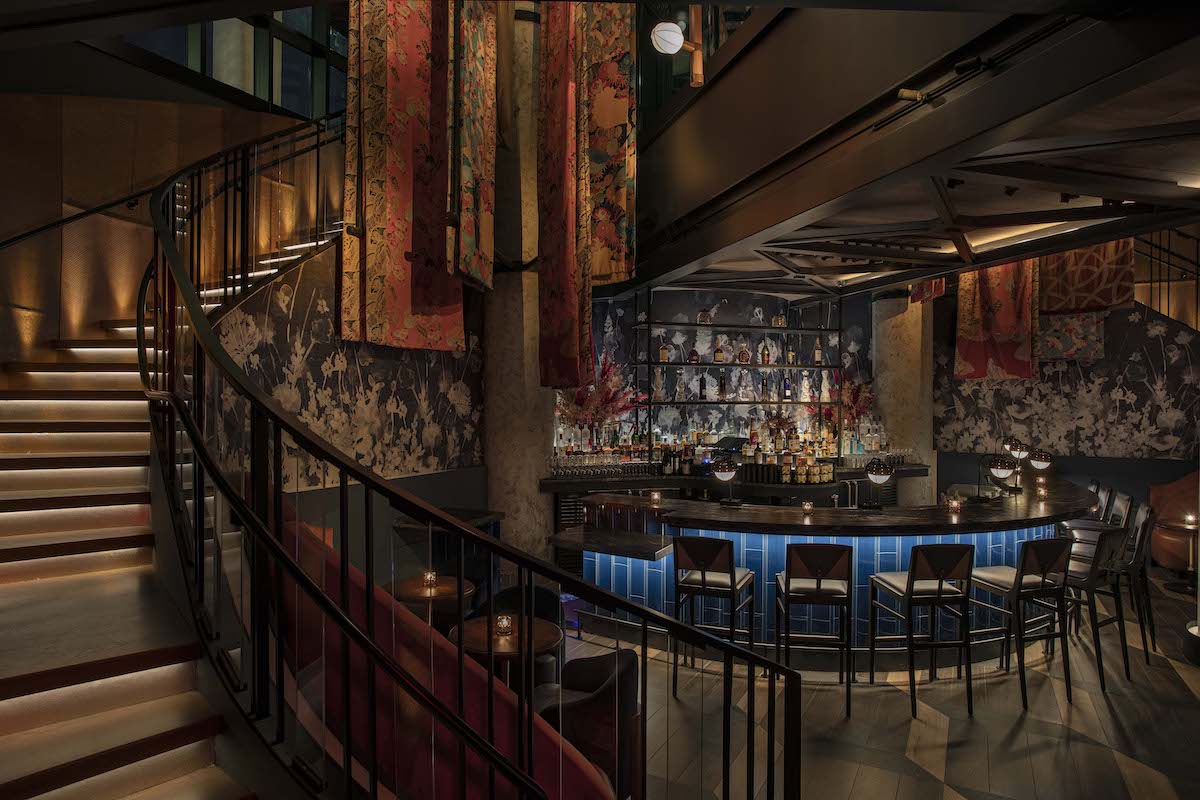
Image credit: Michael Kleinberg
Coming back up for air, I take the lifts to the hotel’s final, but perhaps most impressive F&B outlet, The Highlight Room, located on the 16th floor. As the name suggests, it soars high over the rooftops of the Lower East Side and its terrace offers unrivalled views of the financial district to the left and upper Manhattan to the right. Again, the German Winter Gardens are referenced with a giant foliaged tree taking centre stage inside the bar and the room takes advantage of the 360 views by having wrap-around windows throughout. Layers of premium materials — plaster, brass, velvet upholstery, caramel drapery, terrazzo tiles — add a dose of luxury.
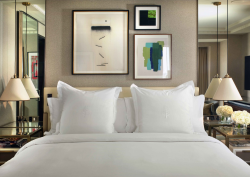
It’s obvious that the guest experience has been placed front and centre in the hotel rooms. They’re not the most spacious, but it’s always been Moxy’s ethos to rather have functional and comfortable rooms. The Moxy Lower East Side delivers on this in spades: supremely comfortable beds with storage underneath; generously spaced but separated shower and toilet; foldable desks; and the signature plug system on the wall instead of a wardrobe. Moxy has really boiled down what guests are looking for when staying at a hotel and delivered that – a good night’s sleep and great water pressure in the shower.
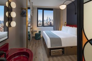
Image credit: Michael Kleinberg
Triple-glazed windows ensure silent nights, and the ones on the higher floors ensure epic city views. Although small, the rooms don’t feel squashed, much helped by the double height ceilings and floor-to-ceiling windows. To maximise on space even further, the sink is placed in the room itself and instead of going for a utility feel, the sink is made into a statement piece itself by composing of glazed lava stone, transforming it into a striking design feature.
Moxy NYC Lower East Side is a triumph in both fantastic designs and a carefully curated guest experience. The stakeholders have really proven themselves as industry heavyweights and it’s a beautiful thing to witness.
Main image credit: Michael Kleinberg


