Less than six months old, Lucarelli is a new restaurant that is sheltered inside Harvey Nichols in Knightsbridge, London. To add flavour to this month’s feature exploring public areas, we spoke to the designers at Flair Studio to learn more…
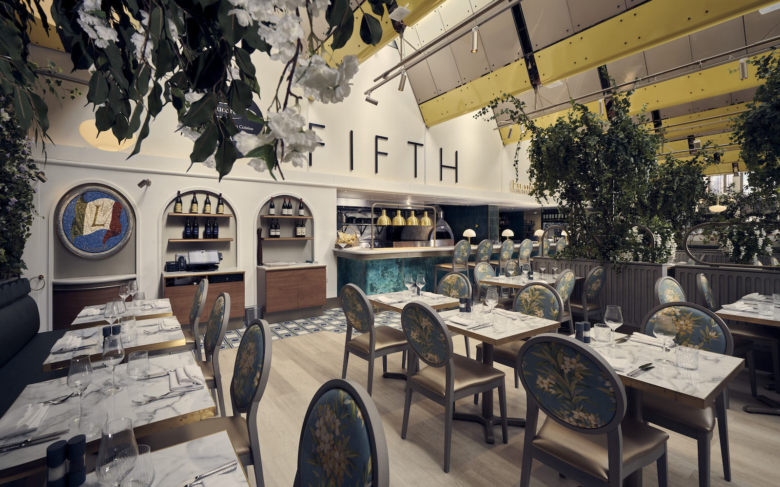
In August 2022, a unique opportunity presented itself for FlairStudio to create a traditional Italian restaurant for Lucarelli and chef Aldo Zilli at the top floor of Harvey Nichols, Knightsbridge. The space, which was once occupied by Yo-Sushi, was closed a few years ago – by the time it entered the interior design studio’s radar, it was time for a new F&B concept to arrive.
The design team conducted a feasibility strategy together with Lucarelli and Harvey Nichols to redefine the whole F&B area, including a new kitchen, which the studio wanted to keep as open as possible. The aim for the new open kitchen was to add a sort of theatre and movement with a real-flame pizza oven and to celebrate the importance of the cuisine. “The result was a 10-metre opening, which we conceived like a bar but this time the pizza oven with the open flame sits at the centre, where the spirits would usually be,” Federico Schilling of FlairStudio told Hotel Designs. “In terms of materials, we opted for dark green Zellige tiles to the kitchen walls so the light blue of the chefs uniform could clearly stand out. The bar is made in Verdigris patina with brass accents, which again recalls the colour of the uniforms.”
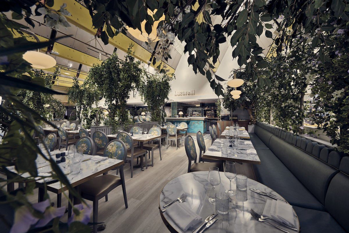
Image credit: Marco Joe Fazio
Like all successful F&B concepts, the focus is to capture people via a strong first impression and for the experience of the design to be layered so that it maintains attention. “We tried to play with the atmosphere of the place to provide a sense of authenticity and familiarity that is enhanced by the open kitchen but then is also filtered down with the use of natural materials, colours and the textures enhanced the natural light coming through the roof lights,” Schilling added. “We tried to build a narrative along the customer route starting from the sense of arrival were you are greeted by the staff in front of the bespoke Italian mosaic, you then walk along the open kitchen and get the opportunity to chat with the chefs before seating down at your table. Screens we also designed so that each table feels protected but has a view into the kitchen.”
While the idea of adding soft barriers in an F&B concept seems simple enough, it did provide the design team with perhaps their largest challenge, as Schilling explained. “Instead of walls, we imagined these screens composed by a timber structure at low level that was carved out to make it appear less bulky, with a metal structure at high level made by a series of arches which have been covered in foliage and sometimes can be used as an opportunity for signage or for decorative lighting. Sometimes they can give a sense of protection, or allow you to watch inside.”
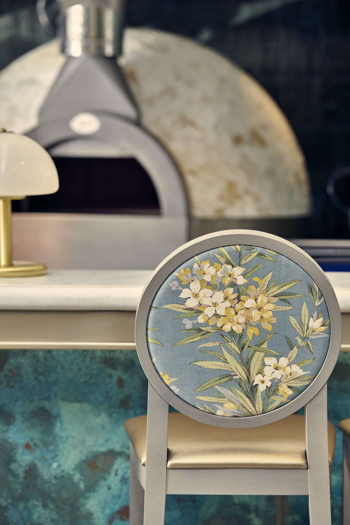
Image credit: Marco Joe Fazio
In addition to designing the space, the studio carefully studied all the operational aspects that included the sense of arrival and the route through the open kitchen as well as the seating area. “These routes are sequenced with a series of arches – sometimes hidden by the plants, sometimes enhanced by decorative lights and artworks, including a mosaic piece that we designed at the entrance that reflect the heritage of the traditional Italian cuisine,” Schilling added.
The main narrative was to create an open garden on the top floor. The idea was to curate the experience to ensure that every detail and operational element plays it part. This was, of course, reflected in the choice of materials, finishes and lights. “To enhance the sense of arrival, we collaborated with mosaicist Giulia Manzoni to design a mosaic piece, a tondo artistico that reflects the Italian heritage of the Lucarelli brand,” explained the designer. “We also designed low-level screens with a series of arches, sometimes hidden by the plants, sometimes enhanced by decorative lights and artworks, to create controlled visions through the main hall while offering privacy and separate areas.”
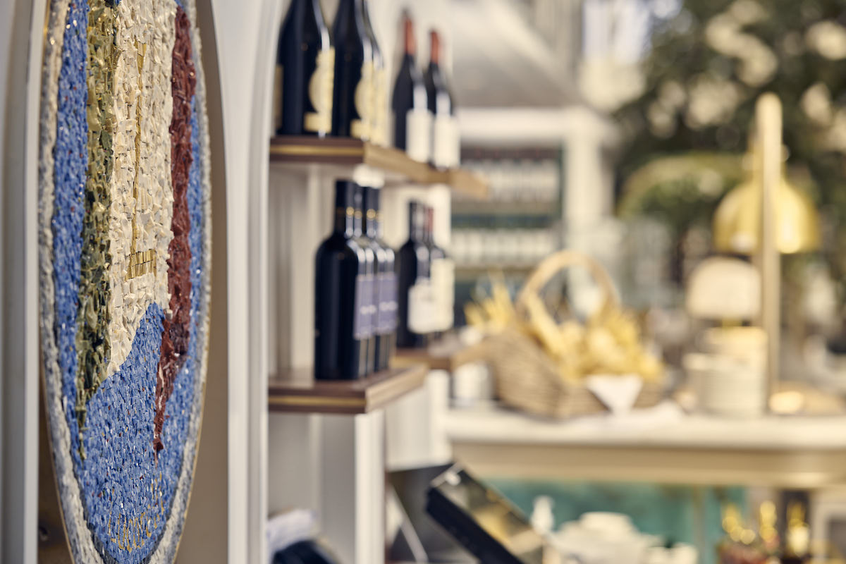
Image credit: Marco Joe Fazio
The result of FlairStudio’s work, to redesign the top-floor F&B space inside Harvey Nichols, is an immersive experience that has been designed to transport its customers somewhere new – perhaps unexpected – away from the noise of the rest of the iconic department store.
> Since you’re here, why not read about this month’s hottest hotel openings?
Main image credit: Marco Joe Fazio


