In Hotel Designs’ second roundtable in association with Arte, Editor Hamish Kilburn gathers a handful of leading interior designers to discuss surface design beyond today’s trends…
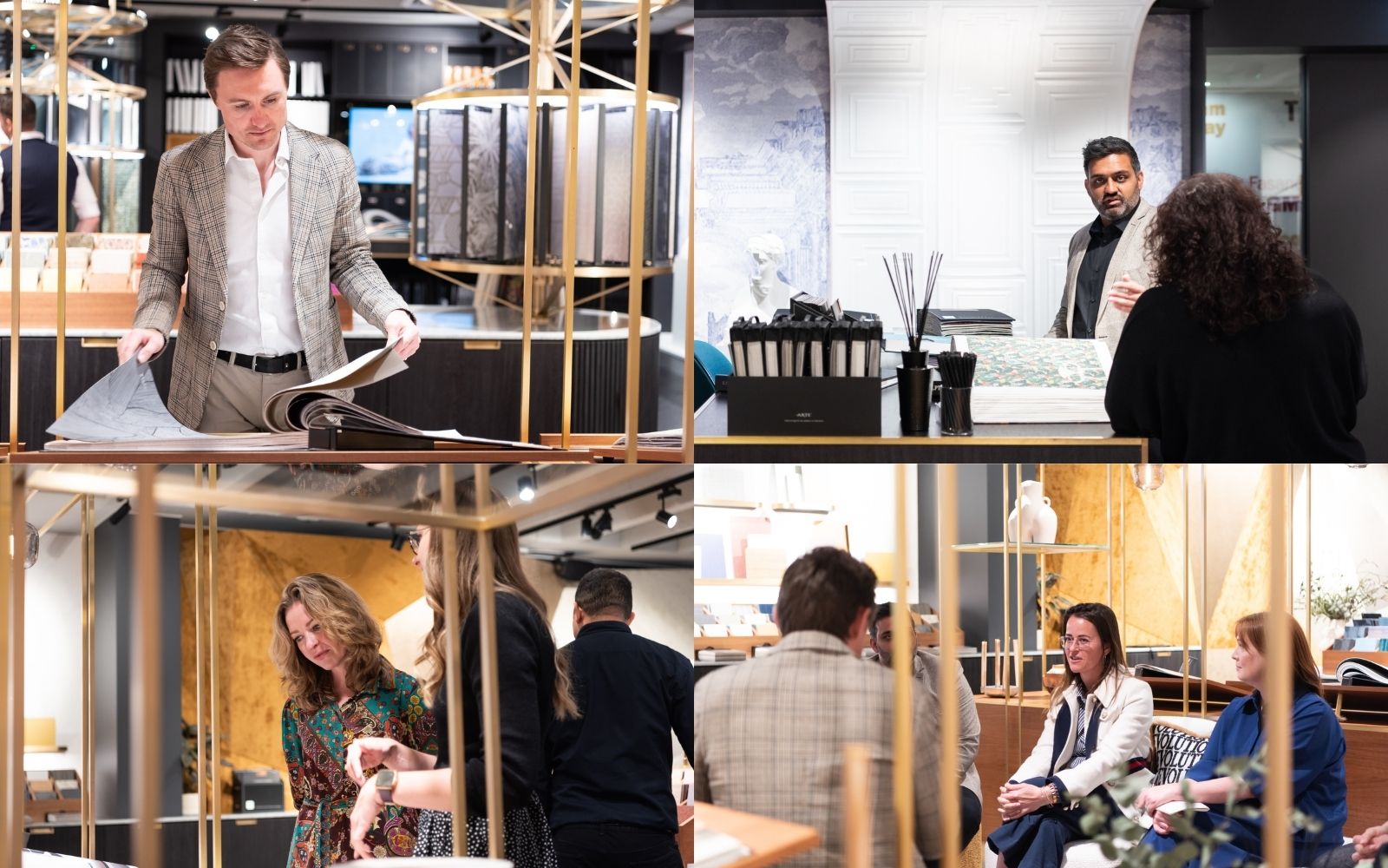
A lot has changed since Hotel Designs was last in the Arte showroom at Design Centre Chelsea Harbour. Putting shifting trends, lifestyle evolutions and pandemics aside, the element that has remained the same is the client’s demand for personal approaches in hotel design. Therefore, editor Hamish Kilburn returned to the stunning showroom, with some interior designers who could help him shine some perspective on adding personality to surface design.
On the panel:
Hamish Kilburn: Is it fair to argue that the role of wallcoverings has emerged from being a backdrop to being more of a focus in a room these days?
Simone Suss: That’s fair to say. I wouldn’t just limit that to walls either. Recently, whether that be in residential or commercial projects, we have explored the value of wallcoverings on ceilings. People are looking for inspiration – and there’s a lot out there whether that be on Instagram or in magazines. A lot of that inspiration is coming from the outside world.
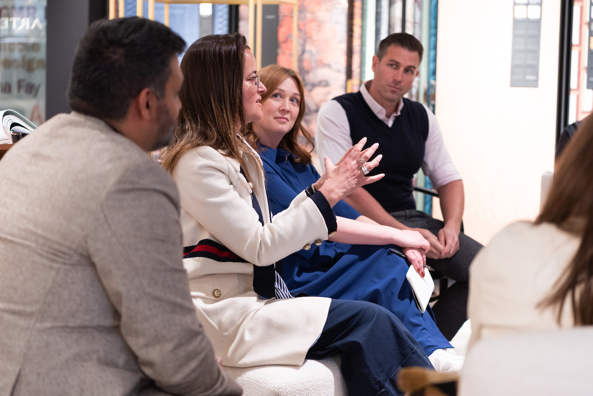
Image credit: Arte
Arun Rana: Wallcoverings in hotels is key. There are so many different experiences sheltered in one hotel. The transitional spaces, such as the lifts and corridors, are sometimes forgotten in terms of design. However, often it is in these areas where you can create the most impact. Surface design, therefore, has become really important.
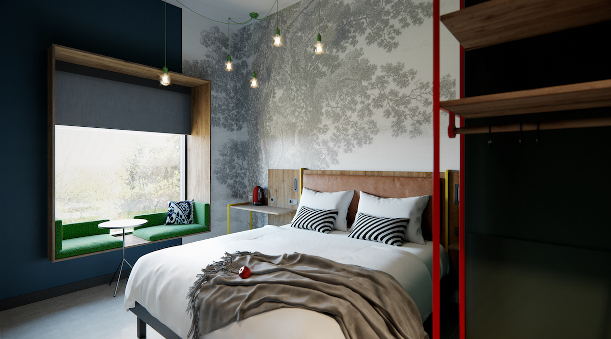
Image credit: Accor/Ibis
In the bedroom, we have seen a lot more ceiling wallpapers or paint finishes coming in, really to create something exciting, and to encourage the guests to look up. The key with wallcoverings in hotel design is understanding how we create an interaction with the guest and the surface, and don’t just make it a backdrop or a textual finish.
At Accor, we have a lot of brands – some standardised and some non-standard. Where there is room for personal touches, they [wallcoverings] are a really clever way to inject some inspiration and artwork, and that helps create the room experience.
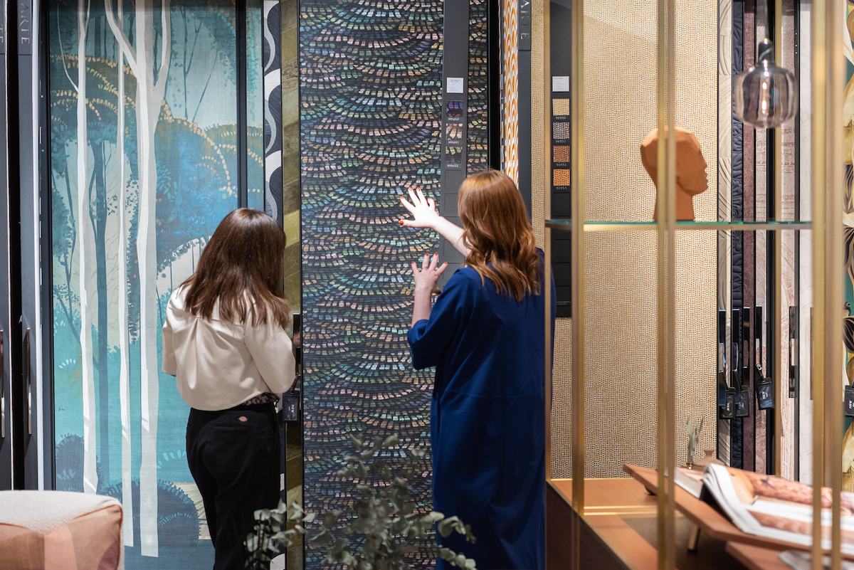
Image credit: Arte
HK: Why is there such a demand for bespoke wallcoverings when brands like Arte offer such an array of patterns, textures and colours?
Jane Maciver: Every client wants something special for their space, and it’s about how you showcase that storytelling element through your design. Art is an effective way to do that. By going bespoke, it really breaks down any creative limitations. It’s incredible how much technology has improved, allowing brands like Arte to print and create some incredible finishes – it’s all happened in the last few years, so it’s quite special.
When we were working on the Mercure Antwerp City, we discovered a history of talented designers and painters, and that gave us the licence to focus this project around creativity. We hired a photographer and stylist, compiled all the fabrics that were used in the upholsteries and we created these garments that we then photographed on figures and the finished prints give the public areas character. It was just fun, unique and gave the lobby inside the hotel a signature element.
AR: Interestingly, the main reason was to hide the stainless steel lift doors. Jane and the team did a fantastic job – and the artwork is wonderful – by using design as a tool to create unexpected moments.
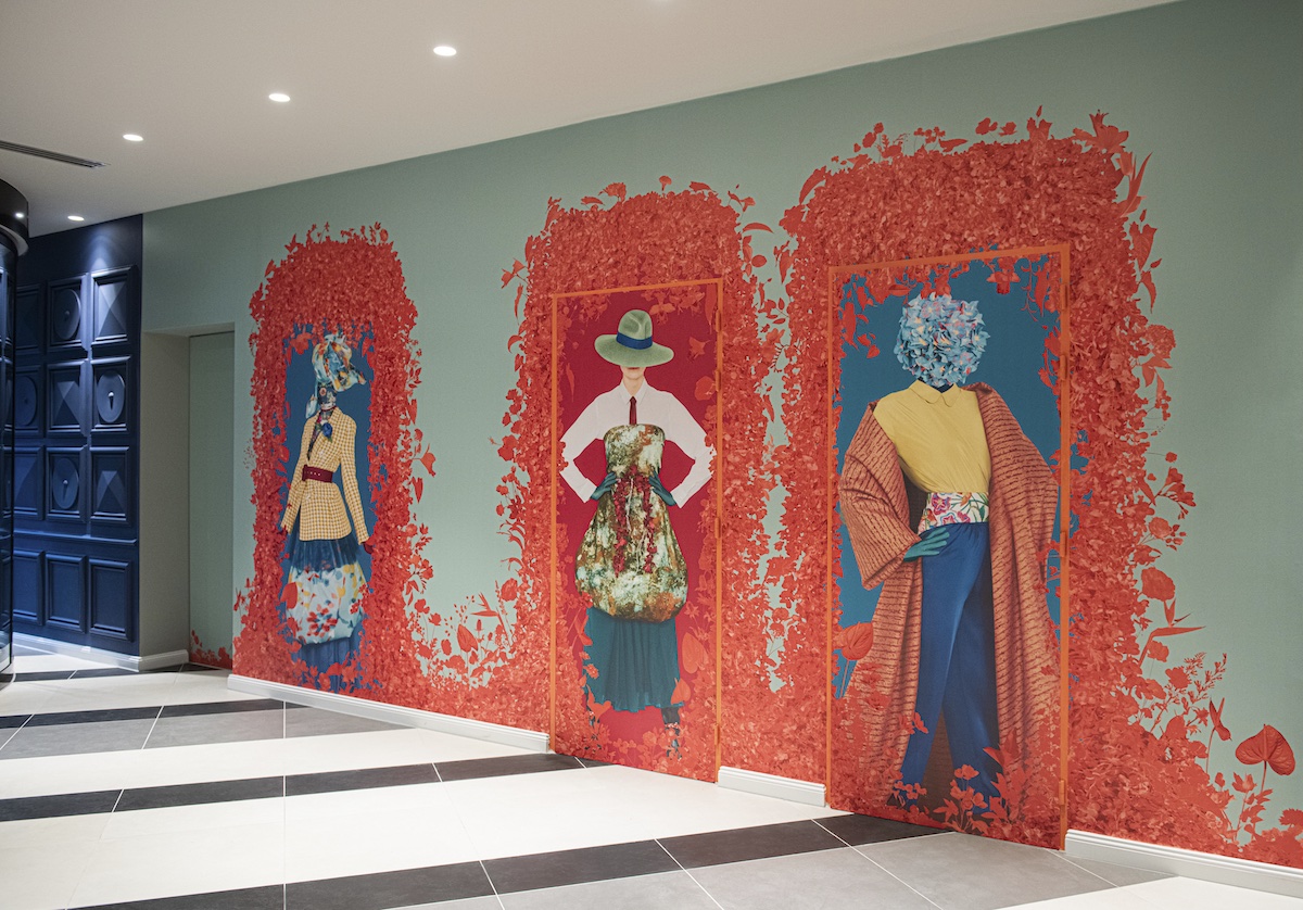
Image credit: Mercure Antwerp City, designed by BuckleyGrayYeoman/Accor
HK: Do wallcoverings therefore have more longevity in terms of the overall design?
Dale Atkinson: Absolutely, and it’s the behaviours of guests – and their new demands – that is largely dictating this. When people travel, they feel like it’s their space. I think people want to almost lose themselves in their space.
Going back to the bespoke point, I think businesses want to have what others can’t in order to offer something different for their guests. Generically speaking, people have more of an understanding, and passion, for design so these details matter. A lot of time with wallcoverings and patterns, you can place them into eras in time. When you have a bespoke finish, it allows you to play with that, which in itself gives the product more longevity.
AR: My role at Accor is to explore a design’s longevity. Typically, we expect a hotel’s concept to work for 15 years. After this, we will hope that the hotel will renovate and become something new. Realistically, though, we have to consider how versatile the design can be. If, for example, the hotel changes hands you don’t want the design to be so niche that the design can’t work for other brands. By having these conversations, we are able to understand how a product can work in a multitude of ways, and really exploring the sustainability qualities of each product.
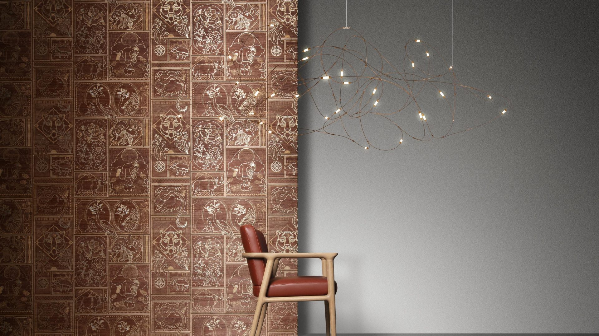
Image credit: Moooi / Arte
HK: How can surface design help to further blur the line between residential and commercial spaces?
DA: Especially nowadays, people have given up having office space. It is very much the same when you are going to a hotel, these spaces have to work harder, and transition throughout the day/evening without the design changing.
I am working on an interesting project at the moment that is all about that concept. It’s a golf club in the New Forest, and using colour and textures has been focus when designing this space. The owners realised that the club is not just about golf; it’s a social space. As much as it is celebrating the game, it is also about the food, the vibes, and creating a private members club that feels warm and inviting.
SS: There’s definitely a heavy demand to blur the boundaries. Hotels want to feel more residential, homes want the quality of hotels and offices have emerged from the pandemic really having to be all things to all people. This is where design comes into its strength, because it makes the guests/clients feel a certain way and influence how people behave in a certain way. Wallcoverings are a big part of that because they can help set the tone that impacts the space.
HK: I reviewed a hotel recently where there was a distinct lack of art in a 12th century castle. The walls were simple and featured empty frames. This makes me question whether we should be considering wallcoverings as art…
Wren Loucks: Wallcoverings are so much more than decorative elements within a design. They can be used for wayfinding. Strong patterns can really help people with visual impairments or who have cognitive or neurodiversity differences. These surfaces can be incredibly practical.
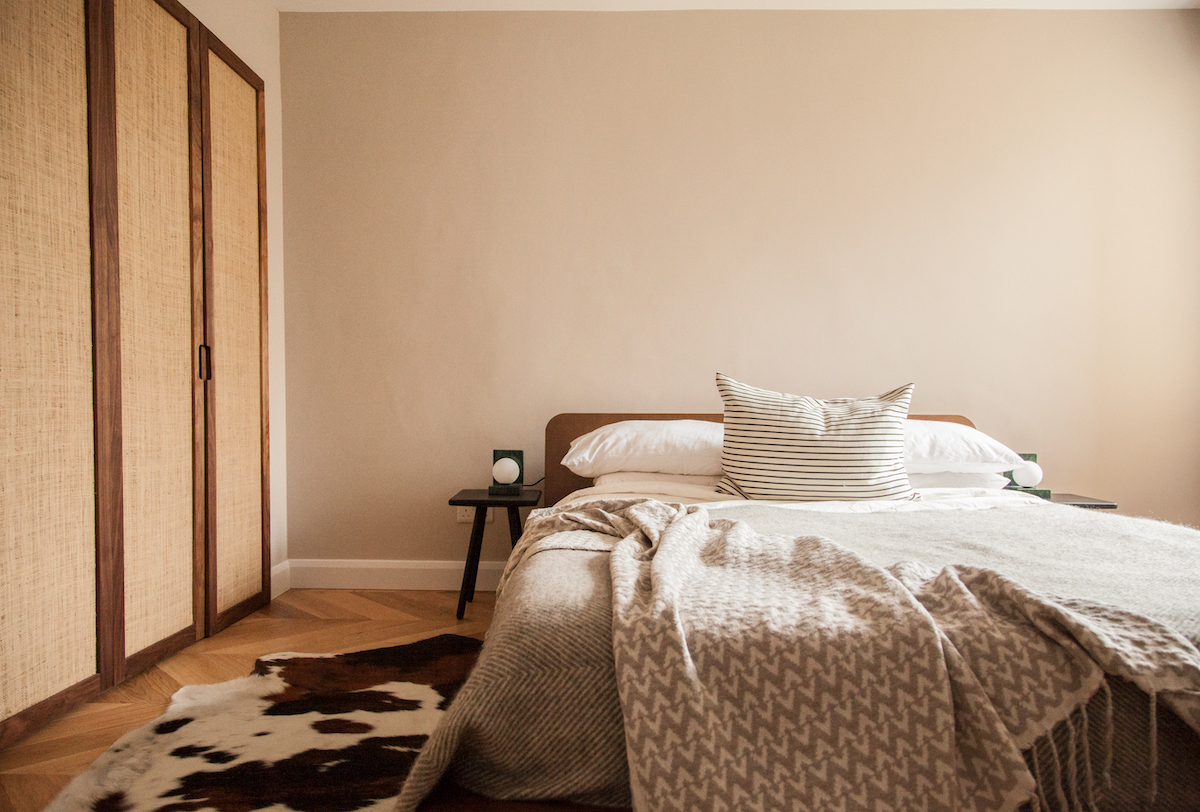
Image credit: Be-kin
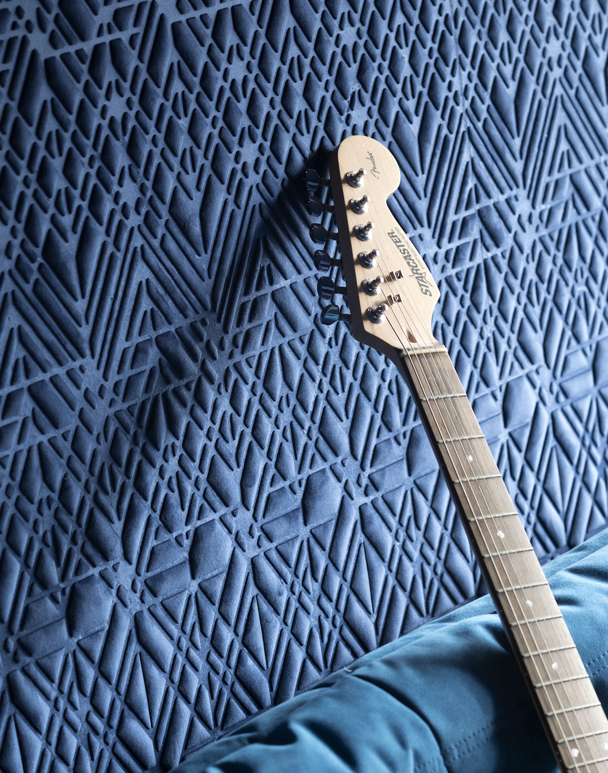
AR: We have spoken about how hard hotels have to work, but in order to shelter all these different experiences, designers need to carefully and subtly create different zones. Wallcoverings have such versatility. Sitting in this room alone, you have your essentials range, then you have your bold, 3D patterns that can resemble artwork.
HK: How, as designers, do you make ‘personal’ choices while also ensure it’s going to work for the client and the guests? Where is the line drawn?
Michael Simon: I think we all make personal choices when selecting surface materials, and hope that the client will also follow the same journey you are trying to take both them and guests on with your design. During a brief with the client you are always looking to get a feel of the clients taste and how far you believe you can take them off that trail, if you felt you could push the design further. It’s not always possible, and budget constraints can be a deciding factor.
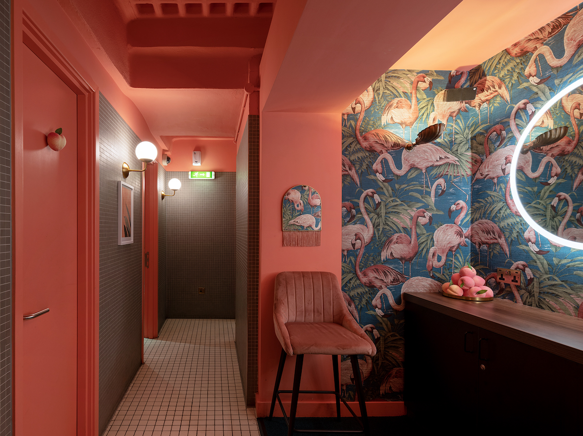
Image credit: Rumours Restaurant London/LXA
AR: Design is subjective, and in my role I end up having deep conversations about what we keep and what we remove. The personal decisions we make are around the guest journey. We have already touched on this. Generally speaking, for us the design process is much like a triangle. The arrival (the base) should feel heavy, and as you move through the space it should become lighter and when you reach the guestrooms, it should be a calm, tranquil spaces.
In spaces people are spending less time, you can afford to go bolder. In guestrooms, though, which is where guests will likely spend most of their time, going bold is not always practical. If you are going to go for a statement piece in a room, then I would advise to use the headboard wall, because it’s usually the first thing people see when they enter and guests are sitting on their bed, perhaps watching TV, that wall is not always going to be visible – and not too invasive.
DA: In the last hotel I worked on, we decided to dress the headboards in a bold fabric. It was a seamless way to challenge the demand for ‘feature walls’, which, I must admit, feel a bit dated and they often end up fighting with other elements in the room. This decision allowed us to create a cohesive link between the furniture and the fabrics in the room, it gave the room added texture, which really worked when answering the brief, and added to the overall guest experience.
JM: I think in these situations, it’s about not forcing the design. It’s really about letting the design develop to create the right space for the product.
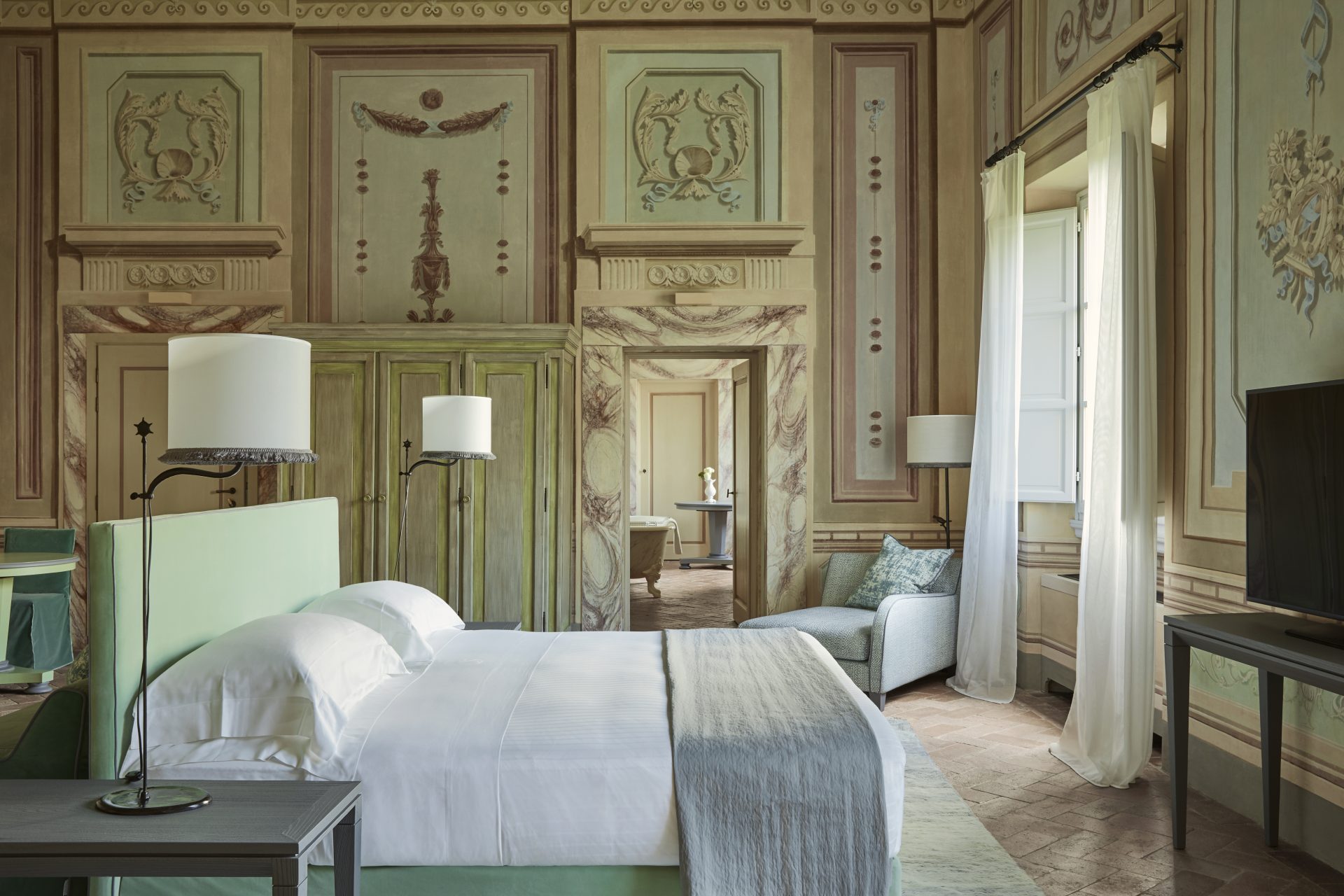
Image credit: COMO Castella del Nero
HK: Injecting biophilic design and portraying escapism is such a focus in a lot of projects, at the moment. How, through surface design for example, can you do this sensitively?
WL: There are a lot of studies that show that just by looking at images of nature, it reduces cortisol levels. Therefore, it’s not too gimmicky to have images of nature in and around the public areas of hotels.
SS: Anything that calms the senses the way that nature does. We are looking at preserved living walls, because the maintenance of ‘living’ walls is quite a commitment. So, the client will not get the oxygenated benefits, but just by looking at nature creates a feeling.
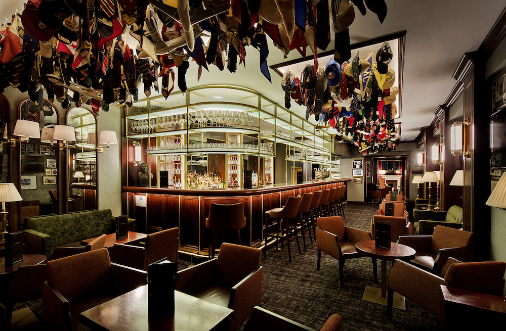
Image credit: Rosendale Design
HK: In an industry that strives to think unconventionally – where technology is opening up so many new opportunities when it comes to design possibilities – is surface design limitless, or are there certain rules we need to abide by?
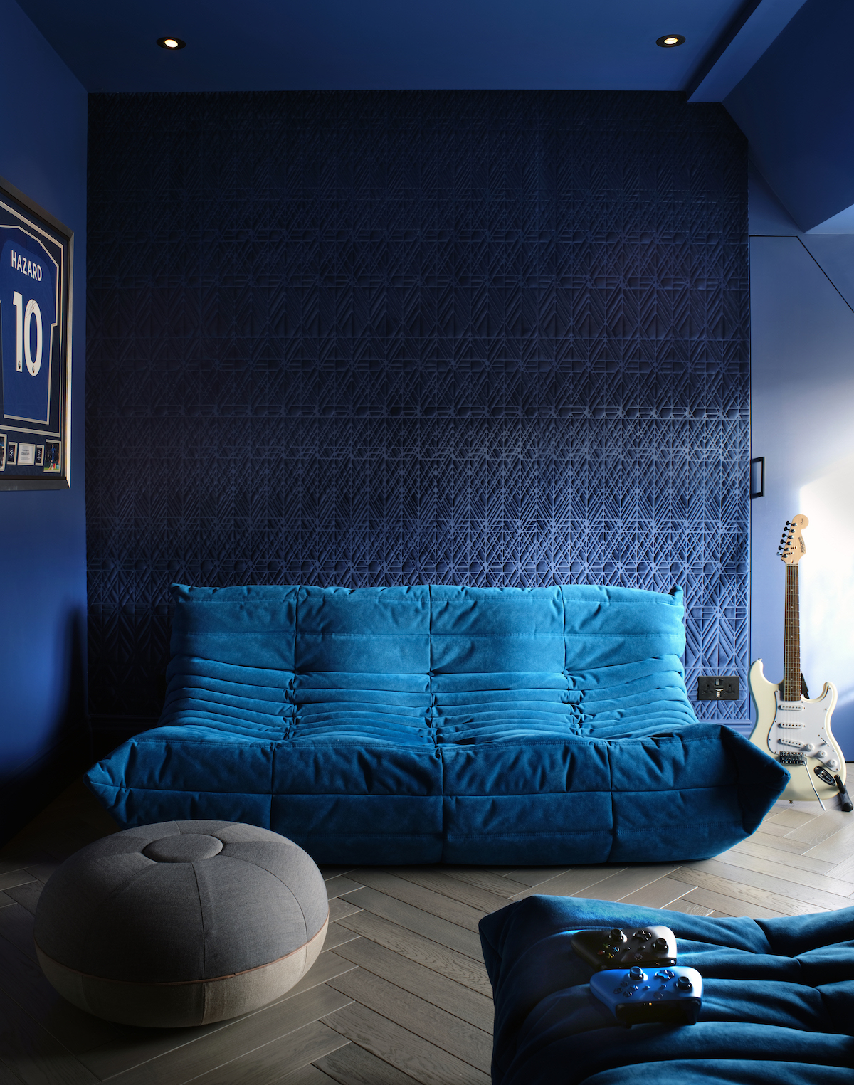
DA: I think this is about understanding the technology and the design, instead of meaninglessly purchasing products. Texture is such a good way to play with the room. Not only do you get to explore shadows, depending how you use it, but the product ends up lasting longer. If you have overly flat colours, you are going to notice smudges than if you have movement in colour. Thanks to technology, texture can be explored in so many different ways when it comes to surface design.
WL: Where this conversation gets really interesting is how much we can now do around sensory design. I have designed offices for large companies in the past, and there’s a real demand in offices, and hotels now, for spaces to understand guests’ sensory profiles.
AR: Technology is more than digital. Until today, I was not aware of Arte’s microfibre properties. This, for me, falls into technological innovation. The fact that these wallcoverings don’t absorb smell and are easy to clean means that all of a sudden you can use them for a headboard. Technology that as designers we need to be aware of is not just the interface technology that guests can see. It’s refreshing to see that suppliers are doing the hard work.
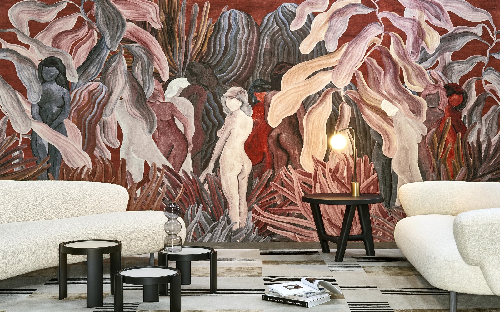
Image credit: Arte
HK: With everything you are saying, it’s clear that wallcoverings have more value than ever before. With this in mind, are clients willing to spend more money on wallcoverings?
JM: It’s a balance. There’s always a budget and it’s about weighing up this element with the others in the room.
AR: Balance is the right word. It has to be achievable. Designers have to consider where and how much to use wallcoverings. What I would say, though, is that there is more room to have these conversations. With the demand for ‘experiences’ in hotels, design has to work harder. There are clever ways to achieve this look and feel within the parameters of the budget.
From my perspective, the trend I am seeing is that there is more of a focus on art, objects and styling. With the demand for hotels to be home-from-homes, artwork and objects play a large role. They are really key and they dress a space and when it is embraced it is done very well to give the space more meaning. That being said, with the lines blurring between artwork and surface design, wallcoverings also play a large role when it comes to layering, depending on the texture.
Arte is one of our Recommended Suppliers and regularly features in our Supplier News section of the website. If you are interested in becoming one of our Recommended Suppliers, please email Katy Phillips.
Main image credit: Arte


