Hamish Kilburn, Editor of Hotel Designs, caught up with Jacu Strauss, Creative Director of Lore Group, to understand the design narrative inside One Hundred Shoreditch…
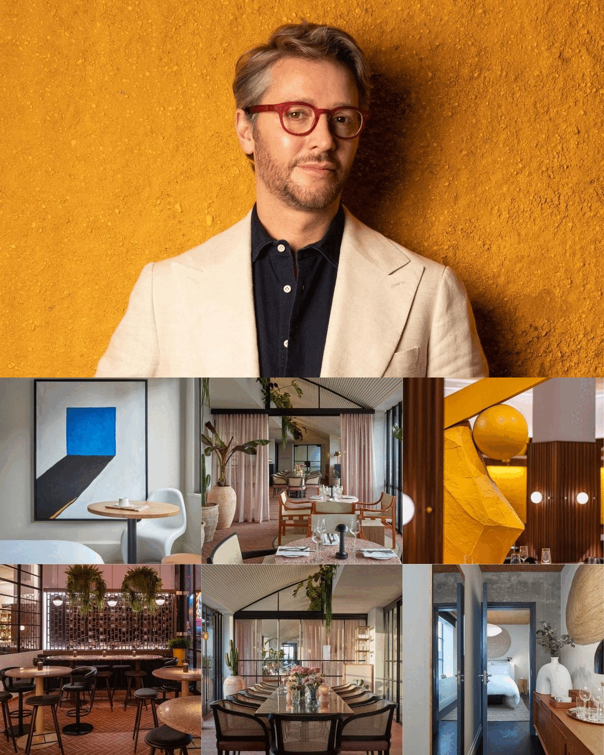
Lore Group’s second hotel in London, One Hundred Shoreditch, will open its doors this month. In our ‘sneak peek’ inside the new hotel, we explored how all areas inside would reflect how the area has evolved during the last decade, with interiors that mirror the neighbourhood’s new, grown-up feel while retaining the buzz and vibrancy synonymous with the area in the hotel’s public spaces.
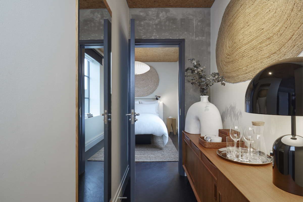
Image credit: Lore Group
One Hundred Shoreditch takes over from what was the Ace Hotel London Shoreditch, which, when it opened in 2013, was among the cluster of hotels that became a new generation of luxury-lifestyle hospitality in East London.
Seven year’s later, though, when Ace Hotels bid farewell to London in 2020, designer Jacu Strauss, Lore Group’s Creative Director, began planning his latest masterpiece.
Before the hotel officially opens in just a few weeks from now, I went to meet Struass on site to understand the pressures he faced and the opportunities he found when designing the 258-key hotel.
Hamish Kilburn: Jacu! I love what you’ve done with the place… So tell me, when did you first learn that Lore Group would be taking over this hotel?
Jacu Strauss: We started looking into it around April 2020. The hotel was closed due to the pandemic so we thought it was a good time to evaluate the next chapter for the building, which our group had owned for several years. We decided it was a good time to rebrand and redesign to reflect how Shoreditch had matured in previous years.
“We wanted to maintain that energy but at the same time redesign the spaces to feel more inviting and more connected to the street scape.” – Jacu Strauss, Creative Director, Lore Group.
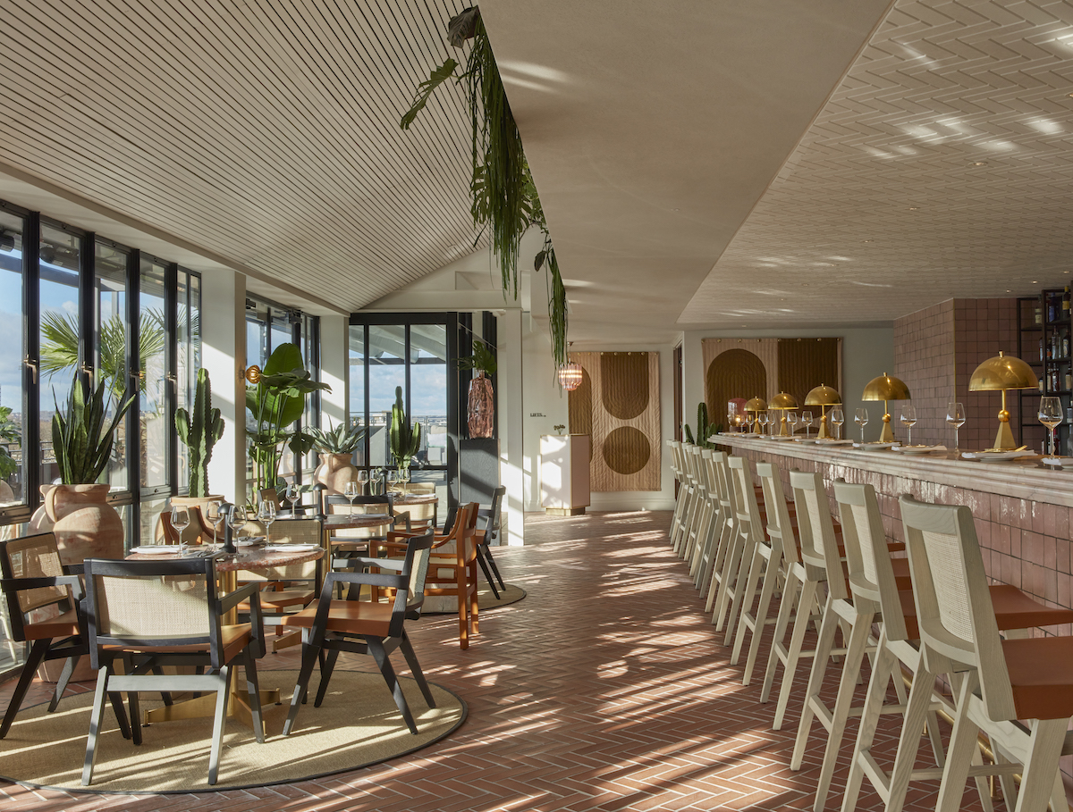
Image credit: Lore Group
HK: How have you captured the essence of Shoreditch in this hotel?
JS: The true spirit of Shoreditch historically has been about welcoming new visitors and celebrating what they bring and leave behind. I feel One Hundred Shoreditch is a hotel that welcomes a diverse crowd, and that to me is the essence of Shoreditch. Our rooftop space, for example, is open to all, unlike most in the neighbourhood that operate in a more exclusive manner.
HK: We first met back in 2014 when you unveiled your design scheme inside The Pulizter Amsterdam. What is it with you and breathing new life into iconic buildings?
JS: I have always been interested in the repurposing of buildings rather than demolition and reconstruction. It is a long-term sustainability point of view and I believe the more we start thinking about buildings in this way, the more beautiful they will become. I love bringing the beauty back in buildings, although it involves a lot of research and experimentation to get it right in each different property.
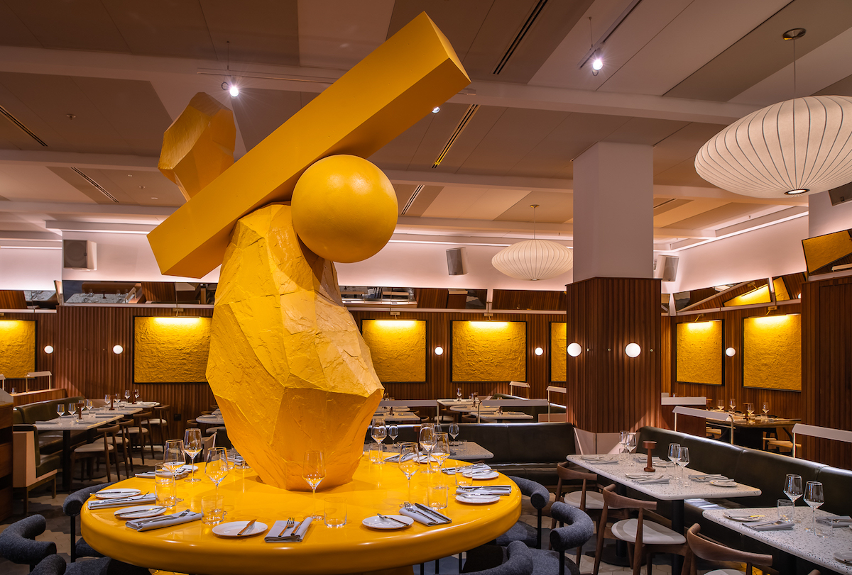
Image credit: Lore Group
HK: What was the design concept here, and what were the major challenges along the way?
JS: We wanted to create a hotel that reflects a more grown-up Shoreditch, compared to what the area was like a decade or so ago. We chose to keep what we thought was beautiful in the building and add to it in order to elevate the overall experience to one that was more comfortable and peaceful in parts, while maintaining the degrees of buzz and energy in the public areas. The new facade was the largest transformation, all in aid of humanising the building and creating a more alluring first impression.
We wanted to create a hotel that was more democratic to its visitors and guests, with genuine personal touches throughout in the design, F&B and overall service. There are several restaurants and bars, and we wanted them each to have their own identity while at the same time collectively form part of one hotel.
HK: The guestrooms and suites feel calm and considered – a juxtaposition from the neighbourhood outside. How did you create this?
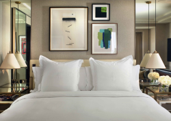
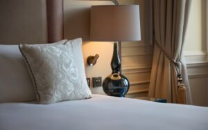
JS: Good hotels are cornerstones in a community and neighbourhood. Most visitors will more often experience the public areas such as restaurants, bars and meeting spaces so these need to have a more upbeat energy that truly echoes the energy within the local area. The rooms and suites are designed to be more of a sanctuary away from it all, with emphasis on comfort. I opted for neutral base palettes and textures: white upholstery (removable covers!), natural tones, soft berber carpets (something you would expect in a great apartment, not a hotel) and generous oversized bedding. I also wanted some pop accents to cut through all the neutrals, and we did this by having custom tapestries with geometric patterns, large hand painted artworks by me and huge oversized white pottery vases, which I also designed.
“London adopted me in a way that made me always think of it as home. What I love most about the city is that one can choose peace or something more energetic, all in the same day.” – Jacu Strauss, Creative Director, Lore Group.
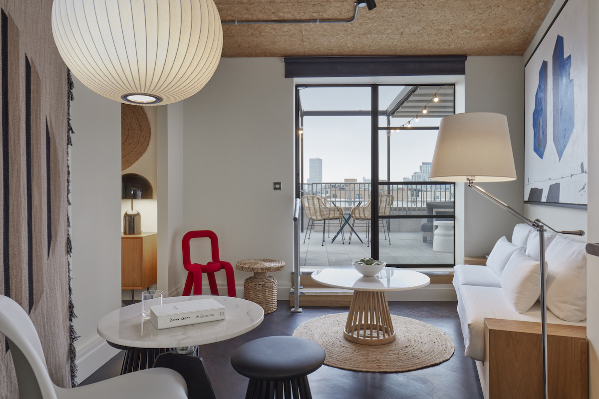
Image credit: Lore Group
HK: How have you evolved since working as a senior designer at Tom Dixon’s Design Research Studio?
JS: I trained as an architect, but hospitality design is something I learned throughout the years, first working on Sea Containers London when I was with Tom Dixon Design Research Studio. I have been lucky to have worked on some very diverse hotel projects in many countries, so I am constantly learning. The fundamentals I learned from Tom have been incredibly important; namely concepting, storytelling, doing what is right and being brave. Along with this, I have been able to apply my own style and passions for design in different ways on each project.
HK: As a man who travels a lot for work, what is it about London that keeps bringing you back?
JS: I moved here from South Africa when I was 18 years old and never went back. London adopted me in a way that made me always think of it as home. What I love most about the city is that one can choose peace or something more energetic, all in the same day. The parks are amazing, and there is a real sense of civility and good manners.
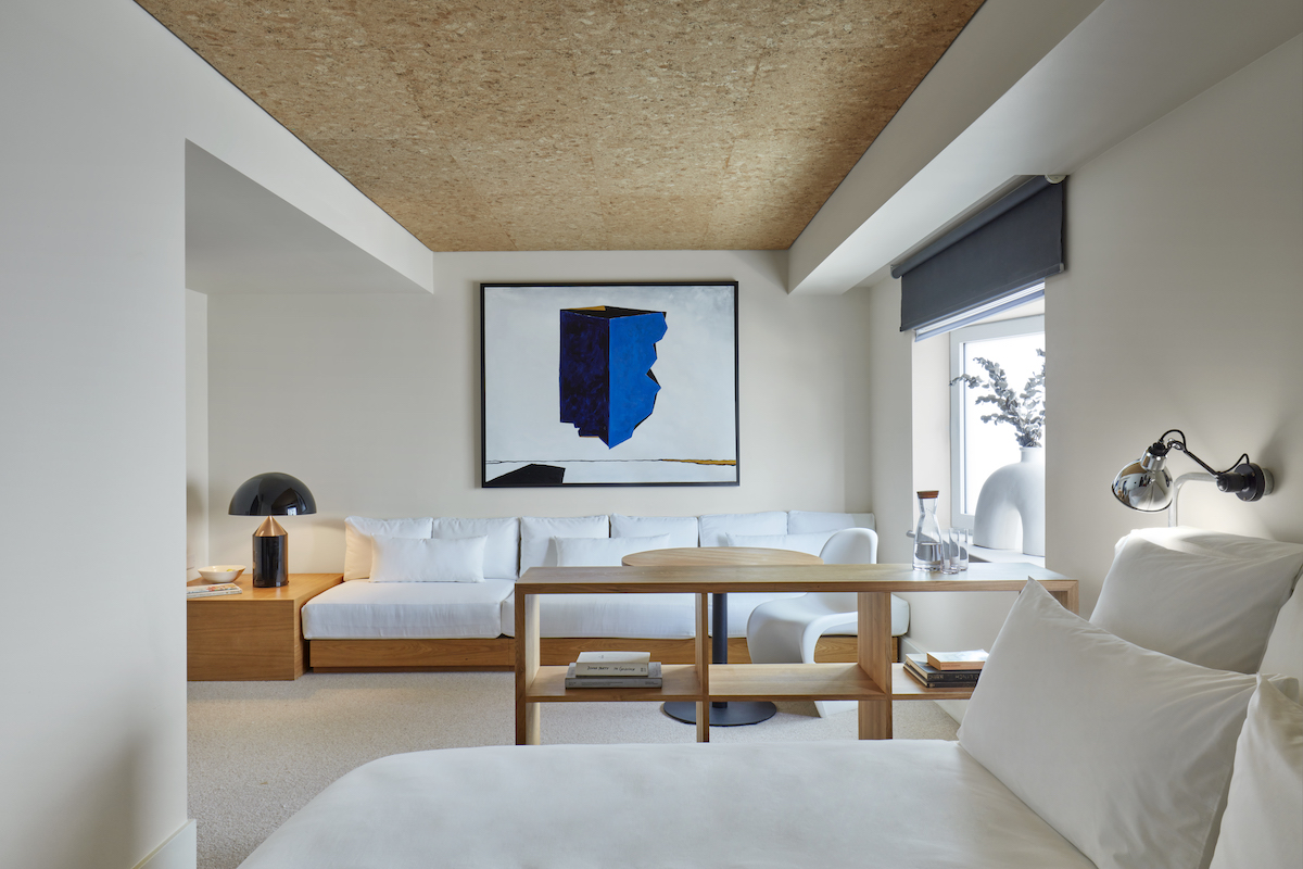
Image credit: Lore Group
HK: When it first opened in its previous guise, this hotel was defined by its public areas. What’s changed from then to now?
JS: The previous hotel captured Shoreditch’s energy in its public areas with people meeting here to party, eat and socialise. We wanted to maintain that energy but at the same time redesign the spaces to feel more inviting and more connected to the street scape. The restaurant, for example, used to be a hidden from the world, and we changed that by introducing a wine bar with lots of glass that connects it more to Shoreditch High Street. Likewise, the lobby feel a lot lighter and softer than it did previously.
QUICK-FIRE ROUND
HK: If you were to describe One Hundred Shoreditch in an emoji, what would it be?
JS: Well, in the bedrooms definitely the snoozing face as any room I design is about great sleep – while in the public areas I’d say the cocktail emoji!
HK: What was your first ever job?
JS: I worked in international remittances at the Royal Bank of Scotland when I was 18, I ended up being a temp for two years!
HK: What’s your go-to cocktail on the menu here?
JS: A Martini, always.
HK: Where in the hotel do you feel most at peace?
JS: Sitting in one of the oriel windows watching the London sunset in the evening.
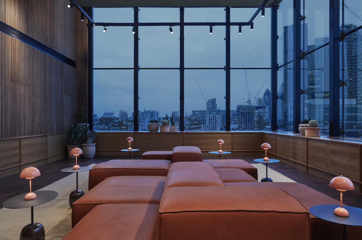
Image credit: Lore Group
HK: You’re not one for following the traffic. Tell us about the quirky details that show that this is a Jacu Straus design?
JS: I think there are personal touches throughout. My team and I are very hands-on. For example, almost all of the art throughout the hotel is created by myself and my team. We physically made it ourselves. Some of the sculptural pieces are collaborations with great manufacturers, such as Jan Hendzel who made the wooden sculptures at the entrance and reception (all made from local wood).
I think something constant in my work is that I never get too serious, while I also avoid trends because I like to do what is right for the property. I also like mix and match contrasting elements. For example, in the lobby I’ve placed one of my favourite Vernen Panton Heart chairs in red next to all white and wooden furniture pieces.
HK: How have the collaborations you have been involved in – including working with Mio Gallery to create new design dimensions using floristry for Riggs Washington D.C.’s in-house eatery – helped you evolve as a modern designer?
JS: Great collaborations are key, and it is also part of my duty to give opportunity to designers and artists who really understand what I am trying to achieve. It is a healthy way for someone like me to learn and often be challenged. I often see collaborations fail in other projects when there is a lack of a brief, and also a lack of understanding how other people work.
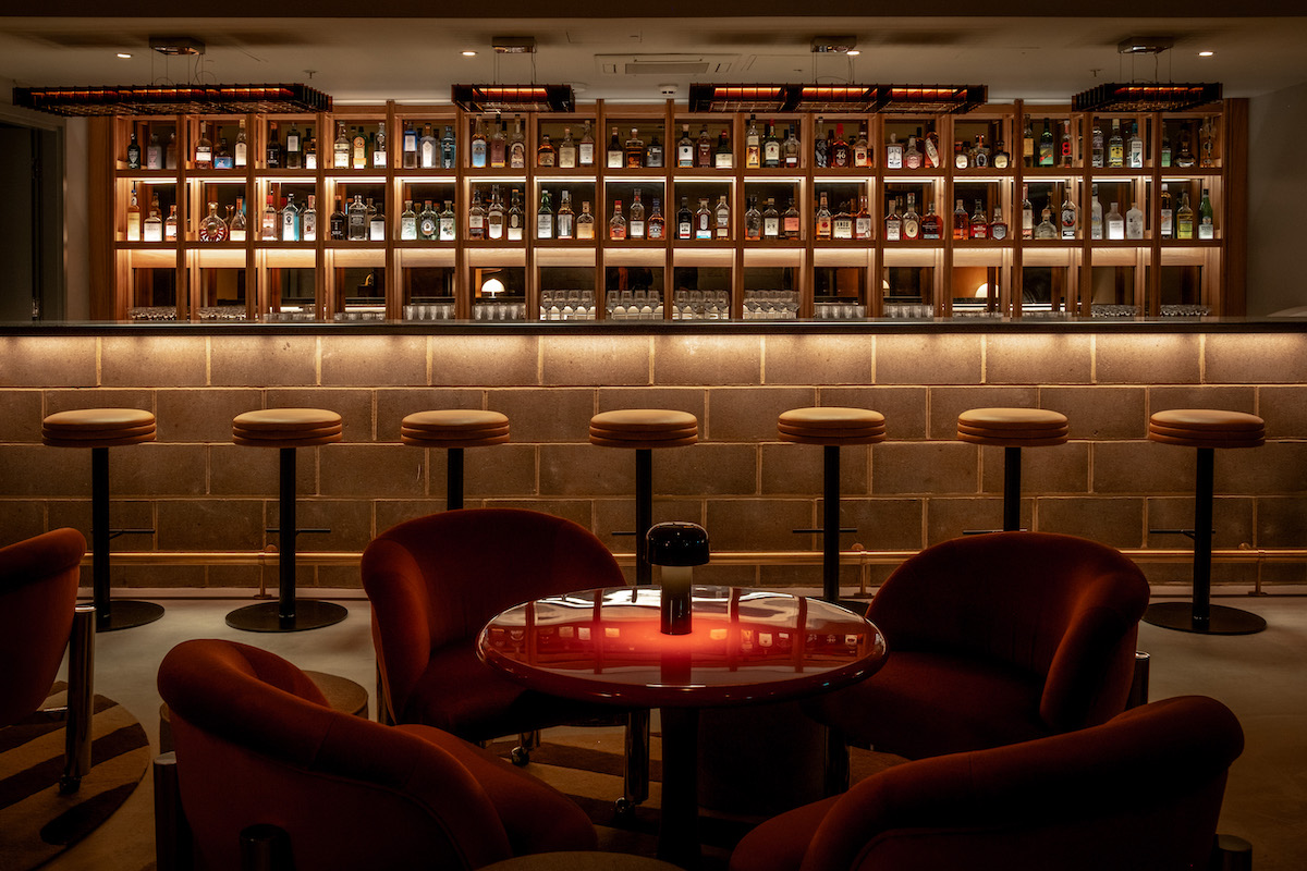
Image credit: Lore Group
HK: One of your previous projects included Super Lyan, which is a modern bar set in a 17th century townhouse in the heart of Amsterdam. What is the secret behind a good destination bar?
JS: It really is very simple: do what is right and it becomes truthful and authentic. It is easy to spot someone trying too hard to impress or spot flaws in their concept. The secret to a good destination bar is to make a visitor feel special and to give them some breathing room to create their own experience. In all the bars I designed we do not dictate the guest experience.
I am aware that design alone does not make a good bar, and I respect the other aspects that, equally, make a bar a success: service, atmosphere and the drinks offering of course.
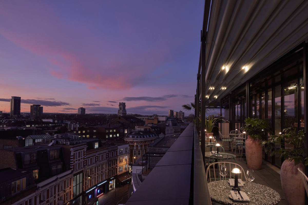
Image credit: Lore Group
HK: What’s next for you and Lore Group?
JS: We have the ambitions and confidence to do more hotels, but we will never do a hotel for the sake of ticking a box. We will never compromise on the importance of storytelling and being contextual to a neighbourhood and city. My work is never done with any of the properties I have designed either, as hotels are organic and we always need to make changes and work on programming.
Main image: Lore Group


