Hotel Designs’ recommended supplier Signbox explores how to make the most out of Pantone’s colour of the year, Living Coral…
Since the 1960s, Pantone has been influencing creatives who rely on its standardised colour reproduction system for design and print continuity, consistency and inspiration. Every year it unveils a new Pantone Colour of the Year to reflect a new season of trends and influences that will fire the imagination of product developers and purchasers, designers and retailers; in 2019 that task falls to the incoming Colour of the Year: Pantone 16-1546 Living Coral.
Described by Pantone as ‘sociable and spirited…the fusion of modern life…a lively presence’, Living Coral looks set to make a rapturous impact on the work of the signage industry’s more ingenious manufacturers – and that means energised workspaces, invigorated teams and an altogether happier working environment.
This isn’t just marketing parlance; according to Pantone, there’s a psychological connection to be had with Living Coral and it could just be the game changer that business owners are looking for if the wellbeing and productivity of their workforces need a lift.
The Pantone Colour Institute is the unit that forecasts global colour trends and advises companies on product and brand visual identity colour palettes to leverage the power of colour – so it knows a thing or two about emotional responses to colour.
“Living Coral’s flamboyant, lively and effervescent shade will mesmerise the mind and create an aura of confidence, energy and positivity.”
“Vibrant, yet mellow Living Coral embraces us with warmth and nourishment to provide comfort and buoyancy in our continually shifting environment’, explains Leatrice Eiseman, Executive Director of the Pantone Colour Institute. “In reaction to the onslaught of digital technology and social media increasingly embedding into daily life, we are seeking authentic and immersive experiences that enable connection and intimacy. Sociable and spirited, the engaging nature of Living Coral welcomes and encourages light-hearted activity. Symbolising our innate need for optimism and joyful pursuits, Living Coral embodies our desire for playful expression.”
Translate that to a workplace or hotel environment and Living Coral’s flamboyant, lively and effervescent shade will mesmerise the mind and create an aura of confidence, energy and positivity. Consider the impact of Living Coral’s hue on branding, wayfinding, environmental graphics and glass manifestation, for example, and it’s easy to see how powerful an interior design scheme can be as a motivating force. It’s a colour that encourages communication too, so expect to see leadership spirits fired and employees galvanised.
The power of colour when it comes to branding
Never underestimate the power of colour to create an emotional relationship with a brand and its physical space. With the capacity to affect us physically, intellectually and emotionally, colour is a critical component when it comes to applying a brand identity and an interior workplace scheme that reflects it.
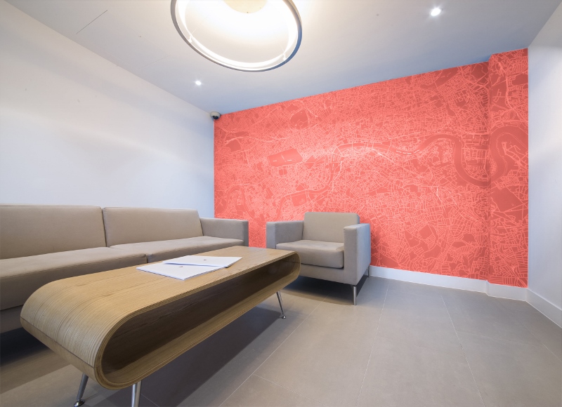
Take digital wallpaper. It can be a big, bold and exciting step that can transform your office vista. But, don’t just choose a show-stopping image to project across your walls and place your order; consider first how your colour palette will influence your team, your partners and clients – the decisions they make and activities they undertake can have a serious effect on your business. Set them up for success with a colour that suits your environment, your market sector and the mood you want to induce.
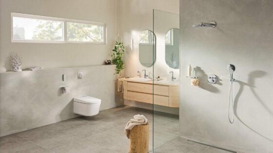
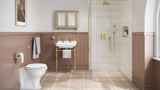
A perfect colour for hotel and leisure environments
Take Living Coral. It’s comprised of red, yellow and orange – colours that can increase workplace productivity and inspire workforce wellbeing. What’s not to love?
- Red is a physical colour that represents courage, strength and excitement – a great colour to use in work areas that demand physical exertion.
- Yellow is an emotional colour that represents creativity, friendliness, optimism and confidence. Incorporate it when you want to stimulate positivity, creativity and happiness.
- Orange blends the physicality of red with the emotion of yellow to create a sense of comfort and nurturing.
So, when you’ve assessed the impact that colours like Living Coral can have on the human body and its emotional relationships with space, you can apply it to the most appropriate areas. Living Coral can inspire transformative change in areas where creativity or physical activity needs an added stimulus – think design studios and gyms, for example. Since it also stimulates socialisation, it could work wonders in hotel and leisure environments – places where you want your clients to linger for longer and spend more perhaps.
If you want more advice on how to use colour to energise, inspire or motivate, talk to Signbox about impactful environmental graphic solutions on +44 (0)1784 438688, click here for our electronic brochure or send us your requirements. If you’d like guidance on what architectural signs or graphics will help your organisation perform better, an on-site consultation will give you the answers you seek.
Signbox is one of our recommended suppliers. To keep up to date with their news, click here. And, if you are interested in becoming one of our recommended suppliers, click here.