Business hotel group Crowne Plaza have declared it a new era for the modern business traveler – they’re revivifying their hotels and making them cooler, brighter and generally more future-proofed.
The hotel group, who are a part of the Intercontinental Hotels Group, are working with creatives NB Studio, who have branded other business hotels ‘generic’ and ‘bland’ and have insisted their new look is much “friendlier”.
Crowne Plaza have reportedly agreed to remove all red from their colour scheme, and have gone in on more positive, lighter palettes. White, yellow, orange, light blue, navy blue and grey will now signify the brand, report Design Week in their report about the redevelopment.
Appealing to a younger audience
Interior designers PearsonLloyd have reportedly come on board for the design to help Crowne Plaza entice in a younger audience, who travel often but refuse to accept the standards of old fashioned hotels.
The international hotel group have 400 hotels in 52 countries throughout the world, and were previously known for their deep purple branding. Now, though, it seems a breezier, more youthful, industrial-chic feel will permeate across their properties as the group roll out the new look.
“Huge… transformative” redesign
Speaking to Design Week, NB Studio called the project “huge” and “transformative”, and noted that it will “elevate the brand out of the traditionally generic world of business travel.”
The redesigns will be a slow and gradual process across the group’s international portfolio.
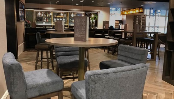
The photo we’ve used is from a Crowne Plaza in Leeds – we’ll update with officially imagery when we receive it.